In past years, I’ve talked about how to improve the legibility of text using both knockouts and halos. Since I wrote those guides, I’ve added one more tool to my arsenal: blurring. This is a technique that was shown to me by Joshua Stevens, who suggested it in a Twitter conversation a few years ago.
Below, we have some text on a busy background. Have a look at the labels for Cold Bay and Unalaska. I’ve given them a hand by knocking out the coastline, but they are still a little tough to read.

Of course, I could have also adjusted the text color/size to help further, but sometimes that’s not always practical or desirable. So, let’s keep the text as-is, and just blur the background a bit.

The difference is significant. The text is foregrounded now, and more easily legible. It’s a simple change, conceptually, but it makes a big difference, especially if the text is smaller or lower-contrast.
Why does this help so much? Because it reduces the number of edges! Humans have special cells in their brain to detect edges, where one color abruptly changes to another. We’re attuned to them, and so they draw a lot of attention. They’re also what text depends upon. For you to perceive the shape of a letter (or any other shape for that matter), your brain has to pick out its edges. And having too many other edges around can make that harder. Notice how you can easily read the black text below when it’s placed against either a light or dark grey background, but it suddenly becomes difficult when those same two background colors are striped.

The problem is all those edges, demanding your attention and adding, in effect, noise. The many edges in the background are distracting you from the important edges that define the shape of the words. If we blur them, the edges of the text become much easier to perceive.

This is also one reason why making knockouts can be helpful — by getting rid of lines underneath our text, we’re reducing the number of competing edges.
So, let’s dive in to how to make this happen. We’ll cover Illustrator and Photoshop, starting with the former. As usual, though, the concept’s the big thing, and if you have a handle on that, you should be able to make this work in plenty of other programs. And in future versions of Illustrator/Photoshop, if they end up changing what the interface looks like.
Illustrator
Let’s go back to the first example. I’ll zoom in on the Cold Bay label.

You can see I’ve got a bunch of layers with text, thematic data, and more. The bottom-most layer happens to be a raster file containing the terrain and the hexagons. By itself, it looks like this:

To begin, I’m going to duplicate that base layer. In my case it’s just one file, but you can do this with a bunch of artwork if you want. The technique is the same, no matter what you have in your basemap layer (including other layers inside that layer). I put the copied layer atop the original, and then I click on the layer’s appearance selector (the little hollow circle to the right of the layer name). It’s important to click the appearance selector for the overall layer, rather than targeting the individual appearances of each item in the layer. If that doesn’t make any sense to you, have a look at my Even Fancier Type Knockouts in Illustrator tutorial, which goes into the distinction.

I’ll head up to the top menu and choose Effect → Blur → Gaussian Blur. The amount of blurring that gets input here will vary based on what’s going on with your basemap, so I can’t give you a number. I’m going to start with 6 pixels, and I can always change it later.

Now it’s blurry. If we turn on our other layers, we can see how it’s starting to look.

Of course, we really only need it to be blurry around the text. Everywhere else, we want to keep our data looking sharp. To do that, we’ll turn to our old friend the opacity mask, which we’ve relief on heavily in some past tutorials. I recommend you have a look at those before we go on, if you’re not familiar with what they are or how they work — I’ll be skipping over the details this time.
First I create an opacity mask for the blurred layer. By default, Clip is set, and (for once) we want that to remain checked. Clip tells Illustrator to hide the layer by default, and only show areas that we specify via the opacity mask’s contents. So at first my blurred layer will disappear. Next up, I select all my labels, copy them, and paste-in-place them into the opacity mask.

Next up I’m going to get rid of the dark halo I have on some labels, and make all of these label copies white. In an opacity mask, remember that white = 100% opacity, and black = 0% opacity. That means that the blurred base layer should show up where the text is. If I quickly switch back to the main map view (outside the opacity mask) and then turn off the text, you can see that happening. Since Clip has been selected, any part of the blurred raster beyond the text areas is hidden.

See how there’s a bit of blurred raster where Cold Bay is? That’s not enough, of course. We need it to blur somewhat beyond the text to be effective. So, I’ll go back to my opacity mask, and give all my labels there a white stroke. I’m going to go with 3 points, though you may want to play around with that. Since my text is white, and the view of my opacity mask is white, there’s not much to see. But if I go back outside the mask and have a look (and turn my text layers back on), we can see that it’s working.

Now the blurred layer extends beyond the text! We’re pretty much done, though there’s one fine-tuning bit that I prefer to do. I like it if the transition between the original and the blurred part is smoother. So I’m going to go back to my opacity mask one last time and select all my text in there. Then I’m going to go to Effect → Stylize → Feather. Note that “Stylize” appears twice in the Illustrator menus; you want the first one.

Feather creates a softening effect on edges. Again, because my text is white, there’s not much to show here. But, here’s what it would look like if my text were black:

I just quickly changed it to black to make things visible, but the real thing needs to be white. The text in the opacity mask controls where the blurred raster shows up, and now it has a fade-in effect, so the blurred raster will, too.

And we’re all set! Note that doing this in Illustrator tends to slow the program down a bit, and lead to large file sizes, so I recommend saving it for the end when you’re finished up the rest of the map. And the labels in the opacity mask are fixed, so if you move a label on the map, don’t forget to move it in the opacity mask, too.

As I mentioned, you can do this to a layer, or a layer that contains layers, or just to a single background image. It’s all the same. You can also make use of the Appearance panel to go back and tweak the amount of blurring. Or you might adjust the feathering or stroke width of the text in the mask, as you prefer.
Photoshop
As you might imagine, you can do the same thing in Photoshop, via a pretty similar process. Here (in this somewhat contrived example), I’ve got some text against a shaded relief background. It’s not too illegible, but it could be a bit better.

Once again, I duplicate my background layer, and I give it a blur (Filter → Blur → Gaussian Blur). In this case I went with 8px, but it will vary with each map. I just turned it up until it seemed like the text was standing out well against the background.

Next we need to once again confine our blurred raster to just the areas around the text. I’m going to hold Cmd (or Ctrl on a PC) and click on the “Some Text” layer. This will select all the pixels in the text. Next, I’ll make that selection a little bigger by going up to the top menu and choosing Select → Modify → Expand. I picked 14 pixels, but, again, your mileage may vary depending on the map.

Next, I go to the Layers panel and make sure I’ve highlighted the blurred layer. Then I hit the Add Layer Mask button along the bottom of the Layers panel, which looks like a dark dot in a light rectangle.
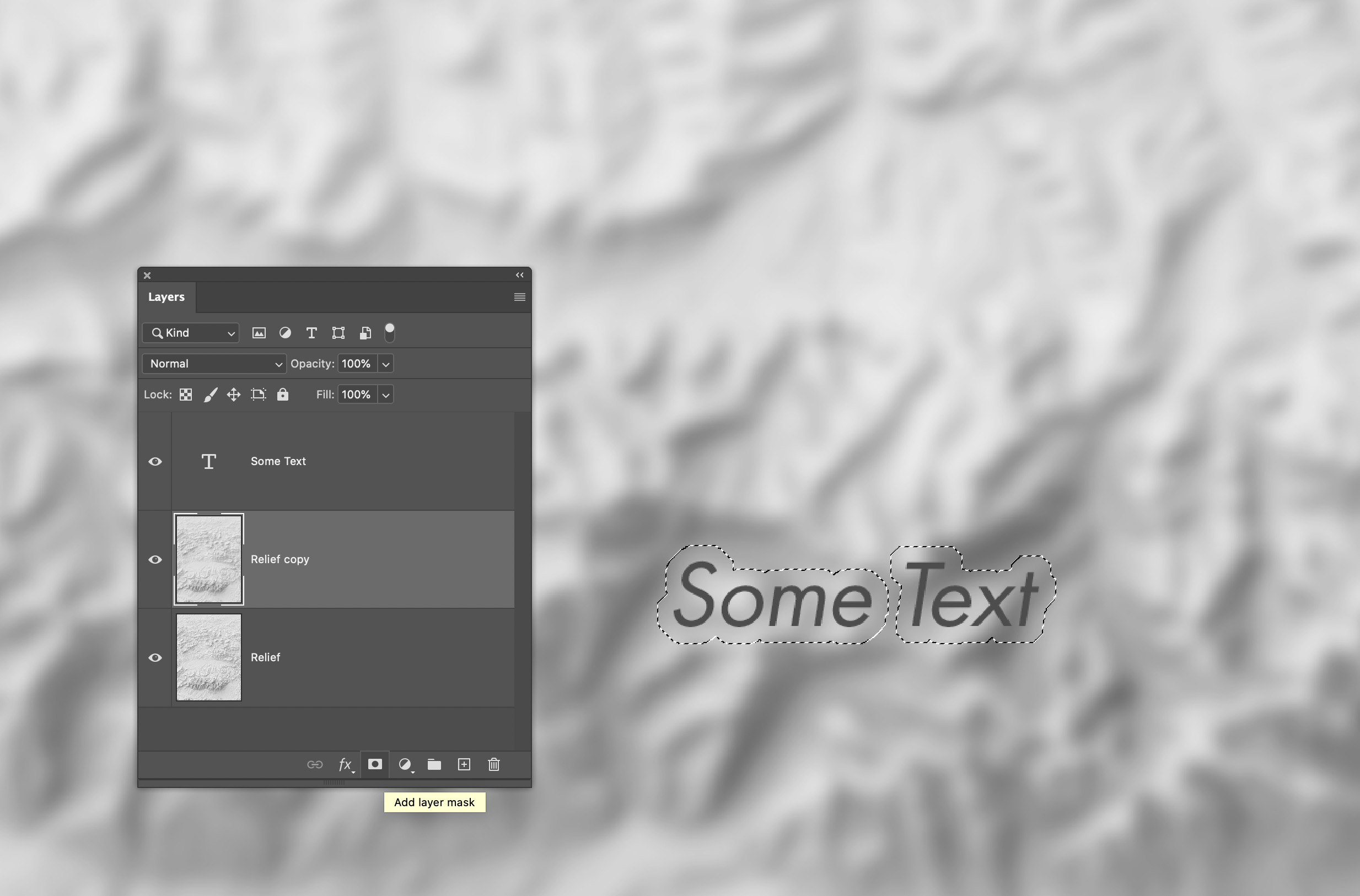
Clicking that creates an opacity mask for the blurred layer, and confines it to the area of our selection (around our text).

Once again, it would be nice to soften that transition a bit. For that I’ll go to the Properties panel (if you don’t see it, go to the top menu and choose Window→ Properties). The contents of the Properties panel vary depending on what you’re doing in Photoshop. I’ll click on the opacity mask in the Layers panel to highlight it, which causes the Properties panel to show me options for adjusting my opacity mask. Then, I can drag the Feather slider, or just type in a number, to soften the edge of my opacity mask.

And now it’s got pretty much the same effect as we achieved in Illustrator. Improved legibility, without having to add a halo or change text/background color. It’s very handy in these sorts of monochrome situations where your palette is restricted.
So I hope you found that useful! And don’t just confine yourself to text — consider using this to boost other parts of your map. Here’s a before/after example of a situation where I used it on a river:


Besides giving the text a boost, it also helped the river stand out better without needing to change its color. The blurring, in effect, smoothed out the terrain underneath the river, giving it a clear valley to flow through. My vector rivers lined up pretty well with the terrain, but this is a good solution when you have a misalignment between the two: just use blurring to carve new river valleys.
I hope you found this useful! Blurring is a great way to get people’s eyes to focus on the edges that are important, and tune out the background.
This tutorial is, and will remain, free. But if you draw value from it, I hope you’ll consider supporting my teaching work using the links below. Thanks to all my patrons who keep content like this going!

2 thoughts on “Blurring Backgrounds to Improve Text Legibility”