Last year, I successfully used this space to prepare a version of my NACIS 2015 talk prior to giving it, and if you’ll indulge me, I will do so again this year. Turns out it’s helpful to write your thoughts down before delivering them to a roomful of 150+ people.
EDIT: If you’d like to see the final talk that came from this, you can view it here: https://youtu.be/npTWWbuZ3AA — it’s an abbreviated version of what you’ll find below, but also contains a sort-of-nice peroration that isn’t found in the text.
For the past couple of years, I have been mapping the terrain of Michigan. Though the phrase “past couple of years” may be misleading: I worked on a first draft for a couple of months in 2014, and a second draft for a month in 2015, and now it’s still sitting there, almost-but-not-quite done. When it’s properly done, I’ll post more about my rationale for making it & some design decisions, but in short: it’s a love song to my home, a chance for me to explore and understand its landforms more intimately, and an opportunity for me to build some terrain mapping skills—putting into practice all of the lessons I’ve absorbed over the years from colleagues at NACIS.

I’m often intimidated by the complex maps of others, feeling like I could never achieve the same thing. But seeing how a piece was made—besides being educational—often helps dispel that feeling. So, let’s break this down in Photoshop, layer by layer. This is more of an overview than a step-by-step of what buttons to click; I think it’s more valuable to explain why I beveled something, and leave the Internet to explain what buttons to click to actually apply the bevel effect. Oftentimes I feel like good mapmaking is just a matter of fumbling around, trying to copy others, so that’s what I’ll try and put all of you in a position to do. It worked for Bob Ross’s viewers, after all.
Intertwined in all of this is a story of the people who made this map possible through all of the wisdom they have shared over the years with me, in personal conversations and through presentations I’ve attended. So, you can try and copy me while I tell you about all the people I’ve copied.
Let’s start at the bottom, with land cover. We open with a simple light green fill. This will stand in for most of the non-woody vegetation in the state: grasses, crops, etc.

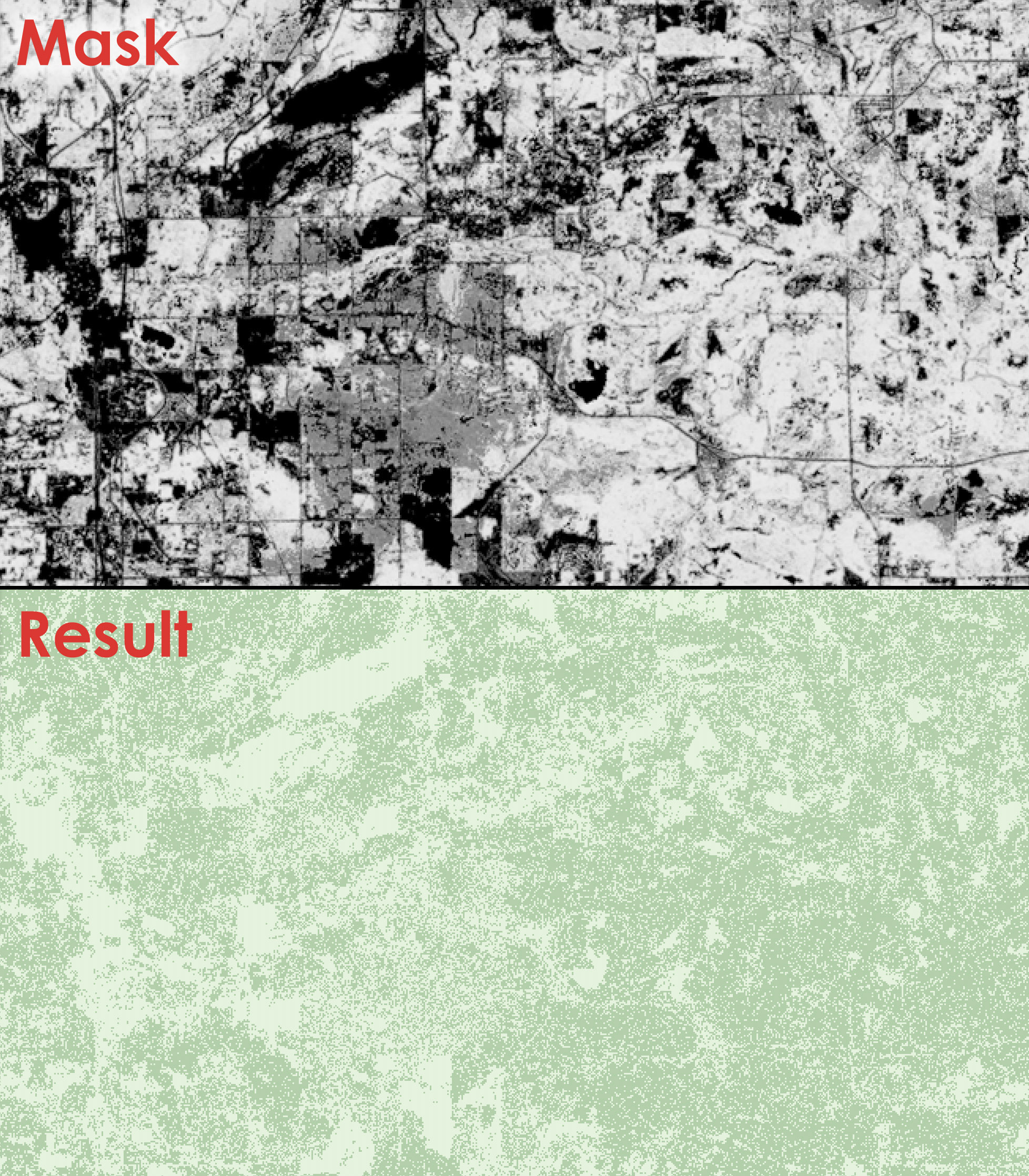
To that, we’ll add some trees in a darker green. To do this, I make use of a tree cover layer from the National Land Cover Database. It tells me, per pixel, what percentage of that area is covered by tree canopy.

(Aside: NLCD only covers the United States. This map covers part of Canada; for the most part, I’m not going to talk about dealing with the Canadian “Circa 2000” land cover data because it was a frustrating distraction from what I want to convey here. I’d probably look at using a Landsat-derived source if I were doing it over; maybe for Draft 3.)
To add this to my map, I use it as a opacity mask on a darker green fill layer. So, places where our data show more tree canopy get more of this darker green blended in.

If we zoom in, you can see that I’ve used the Dissolve blending mode. What this basically means is that it’s using the tree mask to control the density of the green pixels, instead of their transparency (as we might expect an opacity mask to do). So the green fill gets sparser or denser based on where the data say there are more trees.
I like this because it gives a little texture. If you want the texture rougher, you could merge these two layers and run a median filter.

Now that we have some basic vegetation, let’s add some other land cover types. Again, all from NLCD data (for the US, at least). Let’s start with wetlands: plenty of those in Michigan. I give them a blue-green color, and put them on top of the vegetation using the Multiply blending mode. This treats the layer sort of like stained glass: it darkens & modifies the vegetation colors underneath, so now we have some waterlogged vegetation.

Setting layers to Multiply in Photoshop (and Illustrator) is a simple but invaluable trick, and it also introduces to us the first character in our story: Tanya Buckingham. Tanya runs the UW Cartography Lab, and has been my mentor since my student days. And she loves setting things to Multiply. I’ve forgotten the origin of so many of the little things I know how do to, but I remember picking up a love for Multiply from her; I use it all the time in mixing colors. In the bigger picture, Tanya is the reason I started going to NACIS, and therefore is indirectly responsible for most of the rest of the stuff I’ve learned that she didn’t teach me personally.
Next up is impervious surfaces: cities & roads. NLCD has some handy data that show not only if an area is mostly concrete, but what percentage impervious surface it is. I blend that in to the landscape again using the Multiply blending mode, so it darkens what’s underneath without totally greying it. I don’t want these areas to stand out too much; just enough to see that they’re there. Some people make these red or purple or otherwise pop them out of the landscape, which makes sense for some applications, but in my case I’d like to keep the cities from distracting us from the vegetation.

Finally I take the Bare Land classification from NLCD and add that in. This land cover type represents areas without vegetation, which could mean it’s bare rock, but in Michigan usually means it’s sand: the state has some of the world’s finest sand dunes, and they’re a big tourist attraction. I give this layer a sort of sandy color using the Color Overlay effect, which just replaces all your pixels with a selected color (which makes it easy to change it layer). Then I drop it on top of everything.

There’s only last piece to the land cover puzzle here, and that is void data. In Canada, there were some spots where the land cover data I had simply listed areas as “unknown.” Since they were small, and they were outside of the map’s subject area, I did what any lazy good mapmaker would do: I filled them in with made-up data.
To do this I used Photoshop’s Content-Aware Fill ability. And herein we introduce another character: Alex Tait. Alex is the Geographer at the National Geographic Society, and among other things he co-founded Practical Cartography Day at NACIS, which is where I picked up a lot of my most useful cartographic ideas. So, like Tanya, he’s indirectly responsible for a lot of what I know. At NACIS 2010 he gave a presentation on “Photoshop Tips for Practical Cartographers,” in which he showed off using Content-Aware Fill to remove pesky clouds from satellite imagery, and so when I saw these void areas in my land cover, I thought back to his talk.
In short, CAF looks around your image and finds a similar-looking area and uses it to fill in your selection. So, I select my voids and tell it to look at the rest of the map and use those patterns to fill them in. After that, there’s also some spot checking and manual adjustments to these made-up areas.

(Aside: I filled these voids in 2014; since then I’ve become aware of other land cover products that I’d probably use instead to avoid this problem, or at least patch in the gaps. But I keep this section here because I think it’s useful to show off Content-Aware Fill.)
So now we have a land cover layer (except water) that will be the basis of the map’s colors. Some people do this with a lot more classes: they might use a separate color to show crops, or show deciduous forests differently than coniferous ones, etc. NLCD has all that data (they have 20 land cover types, in fact). But for my purposes, this was the right balance. It gives the basics, without being too busy. And I like building a color layer from land cover data because it has some realism without being as noisy and cluttered as satellite imagery. It’s a simplified, but recognizable, version of the truth. Good generalization is a caricature, and that’s what cartography comes down to.

Next up comes a little color adjustment: making the land cover more green. I do this here because I sent an earlier draft of this map to Tom Patterson, and he suggested making it more vibrant. As a general rule, I do what Tom Patterson says, because his reputation as one of the foremost cartographers of our era is well-earned. But also I agree with his critique in this instance.
I met Tom at my first NACIS conference, in 2009. I’d admired his maps as a student at UW–Madison, and had already started to idolize him before seeing him in person. I remember walking up to him and basically interrupting his conversation to introduce myself. Which, given that I’m a very shy and introverted person, indicates how badly I wanted to meet him. Since then he has been a great mentor, colleague, and collaborator. I have learned a great deal from his presentations, his articles in Cartographic Perspectives, and our personal conversations. He’s a very friendly and helpful guy and you should definitely all get to know him.
So, he was nice enough to give some feedback on an early draft, and because of that I made things a little greener. The difference is really subtle, but it’s there.

(Aside: you’ll see that all the land cover work done up to this point is flattened into a single layer. I did this to save computing power because I was working with giant, 2–4 GB files.)
Atop this, I add a hue/saturation adjustment layer. It’s got a mask on it, so that it’s only affecting the areas outside of Michigan. I use this layer to make everything a little greyer, a little lighter, and a little bluer. This helps create a distinction between subject and non-subject area.

Next up is the one major piece of land cover we’ve been missing: water. It’s actually built out of 3 pieces.

First off is the water layer from NLCD, combined with vector water bodies from the National Atlas, shown above in white. That covers the lakes pretty well.
Next up is streams, which are often too narrow to appear on NLCD, so—like the water bodies—we need to supplement with vector data. The National Atlas has some great 1:1 million-scale stream data, and that’s where the black lines above come from. I don’t want the map to be dominated by streams, though, so I break them into two classes: major & minor. The minor ones are thin enough that they’re more in the background: on the final map, you can see them if you look close, but they’re not prominent. On the other hand, I want the major rivers of the state to stand out. The problem is the the National Atlas data doesn’t have a way of sorting major from minor. So, here I turn to another data source: Natural Earth.
Natural Earth’s vector data is spearheaded by our 4th character, Nathaniel Vaughn Kelso, a longtime NACIS member with a passion for developing tools and resources to help others make better maps. Most of you are likely familiar with Natural Earth, a data library that underpins a great deal of present-day cartography by providing free, clean, consistent vector & raster layers that align with each other. NVK & Tom Patterson worked together with an army of volunteers to make possible so much of what mapmakers have done since then.
Natural Earth is actually too coarse for what I want (their finest data are at a 1:10 million scale), but it is perfect for telling me which parts of the National Atlas data to use. If a river is significant enough to appear in Natural Earth’s 10 million data, I take the 1 million National Atlas data and mark it as “major” and give it a thicker stroke. I also taper the strokes a bit in Illustrator before bringing it into Photoshop.
Finally, I make all of those layers look more water-like by appling two layer effects in Photoshop: a color overlay to simply turn them all light blue, and a bevel effect. The bevel effect is something else I got from Tanya Buckingham. Adding it gives a little depth to the water by putting a thin shadow on one side and a highlight on the other, embedding the water into the land. Like most good effects, you can’t really tell it’s there on the final map, but you can tell when it’s not.

Next up is the shaded relief. This is a map about landforms, after all. I got my DEM from the National Elevation Dataset, which fortunately covers Canada as well.
Tom Patterson is the shaded relief guru, and my admiration for his work is one of the major reasons I got into doing terrain mapping. He’s got a ton of great advice on his website, so I won’t repeat most of it here. But among other things, I took his advice to keep the relief from being too detailed by downsampling my DEM so that it was about half my intended print resolution.
The relief I’m using was generated with Blender, and I’ve got a discussion & tutorial about it here, so I won’t go into detail. In short: it’s a program I started working with because I think it produces much more natural-looking shadows.

Mixing relief with a color layer can be tricky. I used to have fairly amateurish ways of doing it through simple transparency overlays that muddied my colors and/or darkened everything too much. In recent years I have developed better methods, which owe much to advice I received from both Tanya Buckingham and Tom Patterson (you’ll note I come back to them a lot). Each of them has their own slightly different way of doing it, and mine is a sort of modified hybrid of their approaches. I have a full tutorial here, but I’ll give you the short version.
Basically, I take two copies of my relief and use Levels adjustments in Photoshop to leave just the shadows on one copy and just the highlights on the other.

I then set the shadows to the Linear Burn blending mode, which causes them to darken the land cover underneath (in a way that preserves the color vibrancy better than using the Multiply mode), and set the highlights to the Screen blending mode, which lets them lighten the land cover. So I’m left with a land cover layer that’s lighter and darker as the relief dictates, but still has the same color palette.

Finally, atop that, I use Levels to lighten up the relief in the areas outside of Michigan. Here I’m using that same state-shaped mask that I used to lighten the landcover.

There’s one more piece of landform puzzle, and that’s to add a texture shade. Texture shading is a technique developed by Leland Brown, a mathematician and hiking enthusiast in Los Angeles. It basically helps emphasize edges and small textural details in the landscape.

A raw texture shade is cool to look at, but it’s most valuable when paired with shaded relief. Here, I use the same Linear Burn/Screen method as described above to mix it in with the relief & land cover.

Leland’s work has been a boon to mine, and everyone else who does terrain mapping. He first presented texture shading at NACIS 2010, where he came from outside the world of practicing cartographers. His presence at that meeting was partially due to Tanya Buckingham, who organized the conference that year. She wrote the Call for Participation that found its way to Leland, and her invitation made him feel like his participation, as a hobbyist rather than a professional, would be welcome. NACIS is Nicest, as we say.
At that conference, he met Tom Patterson, with whom he started working on promoting texture shading and making it more easily available via a standalone application. Through Tom’s connections to Brett Casebolt of Natural Graphics, texture shading is now a part of Natural Scene Designer.
So, Tanya helped encourage Leland to come to NACIS, where he met Tom (& me), and because of all that I can now use texture shades on my maps.
As with the relief, I tone down the texture shade outside of Michigan using levels. Notice also that I also have a mask on the texture shade shadows—this mask contains the shaded relief. The basic idea is: let’s not darken the same area twice. If it’s already darkened by the relief, the texture shade is made much more subtle, to keep things from getting way too dark.

Finally, we have the bathymetry, to give some texture to the Great Lakes. I downloaded data from NOAA that had lake depths (as well as incomplete land elevation).

I use a mask to confine the data to just the Great Lakes, and then adjust the levels so that I have a black-to-white gradient.

Then I use a gradient map to change the color scheme. This is a simple tool in Photoshop that lets you turn a greyscale layer into a color one, by simple mapping each level of grey onto a color gradient. So, here I turn the white areas to light blue and the black to a darker blue. It’s all editable on the fly, so if I want to change colors, it’s quick and easy.

And that’s the basemap! If you’re playing along with our home game, the total layer stack is:

It’s a lot of pieces, and the final result is complex, but by breaking it down piece-by-piece, hopefully I’ve shown that it’s often composed of conceptually simple parts. A little green here, a little bevel there, etc. I did not conjure this fully-formed from nothing. It’s just built up from a lot of little operations, and so hopefully I’ve demystified some of this if you’re intimidated like I probably would be.
The final piece of the finished product is the labeling. I went with Minion Pro, because I liked the swash capitals. I won’t get into details about the typographic choices here. Instead, I’ll just highlight a couple of things.

First off, I add a white outer glow to my type, which is based upon a concept I picked up from Tom Patterson a few years ago at a presentation he made to the UW Cartography Lab. I like glows because they’re less heavy than adding a vector halo around the type. Again, I’m trying to do things that people don’t notice are there, but would notice if they weren’t. The glow is modulated a bit by a mask: they show up stronger when the map base gets darker. They hardly show up at all when the type is against light areas and it’s not needed.

The other thing I want to point out is a challenge that I don’t normally face in mapping: what to name things.
There are plenty of interesting landforms in Michigan, but they often have poorly-documented names, or no names at all. The US Board on Geographic Names had some things pretty well covered, but there were plenty of hill ranges, uplands, and more that lacked official toponyms. And even when a feature had a toponym (official or otherwise), I sometimes found only vague or conflicting information about the actual extent of the feature. I spent a lot of time digging through various websites and old maps, and sometimes making gut decisions about what to label things. Hopefully when this map is released it will prompt people to send me improved information so I can prepare a more authoritative draft.

One particularly valuable source was some work by Randall Schaetzl, a geographer at Michigan State University. Among other things, he published a paper dividing the state into a number of physical regions, from which I drew a lot of label inspiration. Co-author on this paper is another NACIS colleague, and co-organizer of this year’s Practical Cartography Day, Carolyn Fish. I’d known her for years through NACIS before stumbling upon her name in this unanticipated context.
Since I was making a lot of semi-arbitrary (but research-backed) decisions, I asked for feedback from yet another colleague I met through NACIS: Leo Dillon. He works at the State Department, and is also a member of the US Board on Geographic Names. He primarily works with foreign names, but he was kind enough to review my domestic naming decisions and run them by some Michigan natives in his office. I also asked for feedback from Tom Patterson, as well, but you’ve already heard enough about how awesome he is.
And there you have the current map. It’s in a second draft; will need one more draft someday when I get around to it, but it’s mostly there.
There are some practical mapmaking takeaways here, and hopefully I’ve inspired some folks to dig into how some of these tools work, or give new techniques a try. But the bigger takeaway is this: the connections I have made to all of these people are what enabled this work far more than any particular knowledge of programs & tools. This is a profession driven by who you know, but not in the traditional sense of “who can get me a job,” but instead “who can keep me growing and learning?” I have been grateful to find that cartography is absolutely brimming with people who want to share, who want to help, and who are willing to dedicate the time to help their colleagues do better work. I owe so much of the quality of my work to these people, and I know that I am not nearly unique for being in that situation. We all depend on each other to keep growing.
I doubtless owe unacknowledged debts on this project, and I apologize to those of you who taught me things that I left off. As the years go on, the sources of my knowledge sometimes fade. Feel free to chime in if you’re responsible for something I’ve done =).
This tutorial is, and will remain, free, but if you derive some value from it, you are welcome to make a donation to support my continued work.

Excellent write-up Daniel! Thanks for passing your knowledge on, just as others have done for you. I grew up in Michigan (Grand Haven). The map is looking beautiful, can’t wait to see it when you’re finished.
Hey Daniel, just listened to your NACIS talk. I ‘ve never created a map using photoshop. This is a simple/basic question but how do you overlay the layers in the correct geographic location?
I use ArcMap or QGIS to prepare each layer before bringing them into Photoshop. Each layer is set to a common projection, and clipped to the same window. In this way, they’ll all align when I move to Photoshop, since it doesn’t have any sense of space. Hope that helps!
This is a brilliant post. I would never have known where to start to build up such texture. Have you explored how much of the Photoshop work could be done in QGIS? Blending modes and layer effects could do a lot of what you describe. Not sure about masks, though.
Thanks! I expect you could definitely make it at least partway with QGIS, but I’ve never explored those options. I’m mostly an Illustrator/Photoshop type person who uses GIS just for the minimal GIS-y stuff =).
Hi Daniel,
In the section on forestry you mentioned that if you were doing this again for the area’s not covered by the forestry Cartographic layer you would derive the data you needed from Landsat. I’m in a situation where I need to derive a Cartographic forestry layer. Could you give me any suggestions on how you did this for the Canadian section of the terrain map?
cheers,
Lucas
Hi Lucas,
I’d give this a try: http://landcover.org/data/landsatTreecover/ — global % tree cover data based on Landsat data. It’s a little coarser, but I think I’d trust it more than the data I ended up using.
Hi Daniel,
The use of the ‘Texture Shader’ tool makes a really nice impact on you map example – is there a freely available version of this tool or is it only used through the Natural Graphics package? Currently reading through your website and it’s all really interesting – well done and thanks for sharing all your knowledge!
James
Thanks for the kind words! Unfortunately, I don’t know of any place to get access to texture shading outside of Natural Scene Designer, or through Eduard (another terrain application that has a fee). Though, I suppose if you’ve got the skillset, you could re-implement the formulas that Leland Brown has published for how it works.