Last May the deadline approached for submissions to the Map Gallery at NACIS 2016, and I didn’t have anything interesting to share. I could have simply let a year go by without showing something off, but that thought instilled in me the irrational (but recurring) fear that I was becoming professionally irrelevant and that my time in cartography would soon be over. So, instead, I submitted a map title and dimensions, and made it Future Daniel’s problem to create something that fit the description I had promised.
On and off over the next few months, the looming deadline spurred me to put together something I’d had a mind to make for a couple of years.

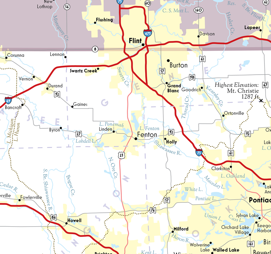
In 1784, a committee headed by Thomas Jefferson proposed dividing the Northwest Territory (as it would later be called) into a set of future states. These recommendations were never carried out, however, and instead of states like Saratoga, Sylvania, and Chersonesus, we ended up with the more familiar Michigan, Illinois, and Wisconsin. But I thought it might be fun to pretend that Jefferson’s ideas had been carried out, and so I decided to map his imagined state of Metropotamia.
Notes on the Data
The map is set in a present-day alternate reality, in which very little is different from our own. I drew mostly on 1:1 million-scale data from the US National Atlas and Atlas of Canada.
States
The only state boundaries/names that have been changed are the ones covered by Jefferson’s proposal. All others remain the same1. Jefferson’s proposed divisions are based on lines of latitude drawn every 2º, and lines of longitude drawn from the Falls of the Ohio (modern-day Louisville) and the mouth of the Kanawha River.

1 Jefferson proposed a state of Washington, and so the state in the Pacific Northwest would probably not be called that. But it’s not shown, so I didn’t think much about it.
Incorporated Places
All incorporated places and urbanized areas are unchanged. Probably some of them would have developed differently based on the alternate state boundaries. But I didn’t have a good way of simulating that. In our own reality, plenty of metropolitan areas cross state lines (see: St. Louis; Washington, DC), so I didn’t worry much about it. Constraints on my time worked to tone down my natural tendency to obsess.
Counties
I took the real-world counties that fell within Metropotamia and mostly left them untouched. I renamed Lucas County to Victory County because I’m bitter about the Toledo War. Counties near the border were sometimes odd sizes/shapes because of how they got clipped by the Metropotamia border, and so I sometimes combined counties or adjusted their borders to make them more sensibly-sized.

Highways
I left the Interstate and US Highway systems untouched. I constructed a new state highway system based on the existing Michigan, Indiana, and Ohio state highways. I was going to simply use the original networks, but each state has somewhat different densities to their state highway systems, and it would have been noticeable. So, I thinned some here, densified some there, rerouted a bit there, to get something that looked a little more consistent.

Aesthetic Choices
In general, I wanted to take this opportunity to make a map of a variety I hadn’t really worked with before. Something in the same zone as a page from a Rand McNally or a National Geographic atlas (though, due to time/momentum, rather less detailed than either of those exemplars). I think these inspirations are very much evident in the style.
Type
I did most of the type in Mark Simon’s Mostra Nuova, which is a typeface I fell in love with years ago, and eventually decided to splurge on. It’s inspired by Art Deco posters, and for the most part I haven’t really had many projects on which to use it. In truth, there’s no particular reason to employ it here — this is not a map which needs to harken back to the interwar period. But Mostra Nuova is awesome-looking, and didn’t feel out of place, so I went with it. The map doesn’t really have a lot of other elements that give it a strong non-generic character, otherwise, so the distinctive typeface is really carrying it here.

For physical features, I went with Sorts Mill Goudy. It’s classic and understated, and leaves Mostra Nuova to take the stage.
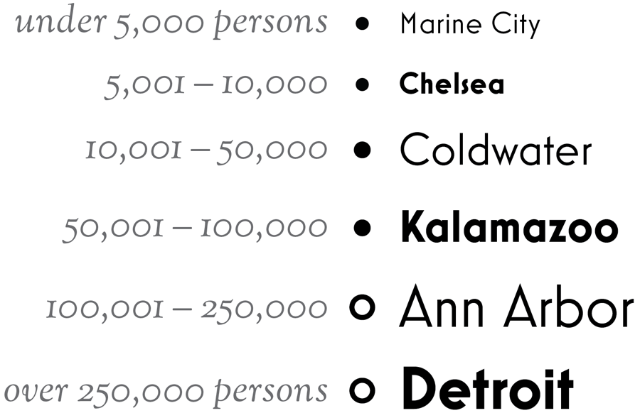
I tried to keep the hierarchy for the settlement labels simple by only using three label sizes, but alternating between the regular and bold weight of each one. Most maps that typographically distinguish population sizes will introduce bold at some point in their hierarchy, and then stick with it as population increases. Someone else has probably done this, but offhand I couldn’t think of any maps that turned bold on and off as population increases. Maybe some people will find my scheme confusing or non-intuitive, but it seems to work for me, at least.
Facts & Flag
In the sidebar, I added a couple of facts about the state, and its flag. The statehood date is the average date of the Michigan, Indiana, and Ohio statehood dates. The population data come from the US Census, in which I just grabbed all census tracts that had their centroid inside the state.

The flag design is not something I spent a lot of time on. Most states have terrible-looking flags, and so I figured I couldn’t really go wrong. The colors of the American flag seemed like a good starting point. Metropotamia means The Mother of Rivers; many rivers originate in the (relatively) high elevations in the middle of the state and flow outward in multiple directions. On the flag, these are represented by the white bands flowing east into the blue Lake Erie, or off to the west to the neighboring state of Assenisipia. So, the flag is a map (which probably doesn’t surprise anyone). Also one thing I didn’t plan, but which worked out: the blue and white form a sideways “M.”
Shields
I designed highway shields for the various states. In reality, some states use very detailed shapes for their highway shields, but I wanted to keep it simple. That’s the great part about mapping fictional places: you can make things easier, at will. I went with generic shapes like triangles and circles. For Metropotamia, though, I used a bowtie shape that’s reminiscent of a capital “M.”

Tint Bands
I don’t get to use tint bands much, but they were important for the atlas-y look here. One challenge they presented was how to layer them with respect to the other map features. It looked odd, for example, to put them on top of the water features, but also kind of odd to put them below, I thought. I went with the latter, anyway, so that at least the rivers would match the color of the water they’re running into.
What Now?
As said, I made this solely so I’d have something to display at NACIS 2016, and so beyond that it’s just another item to be filed under “things I made and now don’t know what to do with.” So, like always, I’ll stick this on Zazzle in case anyone wants to buy a print. You’re also free to just download it and print it out yourself.

While I offer this project as a free PDF, it does take time and effort; if you derive some value from it, you are welcome to make a donation to support my continued work.

Neat piece of alternate history!
Epic