Today I wanted to share with you a little project of mine from a few months ago, which may best be described by the question: What happens if you take the shoreline of a lake, cut it, and unfurl it?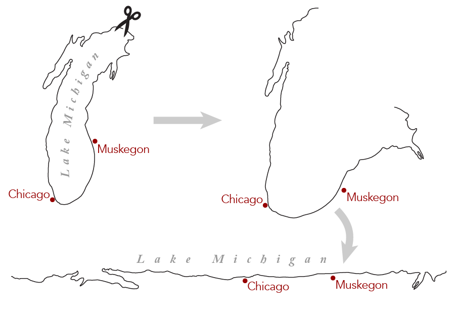
The once-closed shoreline of the lake now becomes linear, providing a new perspective on a familiar feature. Warm up your scrolling finger, because here’s what happened when I linearized Lake Michigan:
Click for an even larger version. Take a while to browse around.
A drive around the lake becomes a reasonably straight line. Not only that, but the map is actually continuous — the roads running off the bottom of the map are the same as those coming in at the top. It provides a unique perspective on the way people arrange themselves around the lake.
I’ll get to the how of all this in a little bit, but first the big question: after seeing my map, most people ask me, “Why did you do this?” Actually, “What’s the point?” is usually how they put it.
Why Make the Map
Like many of my projects, this can be filed under “stuff I spent a huge amount of time making, and now don’t know what to do with.” Partially I did it to see if I could; I’m pleased with the technical achievement of having figured out how to construct the map. But the end result is not just an idle novelty, like the Penrose binning was.
I made this map because I wanted to show space referenced against a natural feature, rather than figuring locations based on the cardinal directions of north/south/etc. I think it’s a very human perspective, grounded in how we relate to the lake, rather than how it looks from space. Rob Roth just wandered by while I was writing this and said that this depicted “configural knowledge,” so there’s your search term if you want to read the academic side of this sort of thing.
As the idea took shape in my mind, it reminded me of a couple of other things that I’d heard about in the past. The first is the 1849 Petition of the Ojibwe Chiefs, sometimes attributed to Kechewaishke.
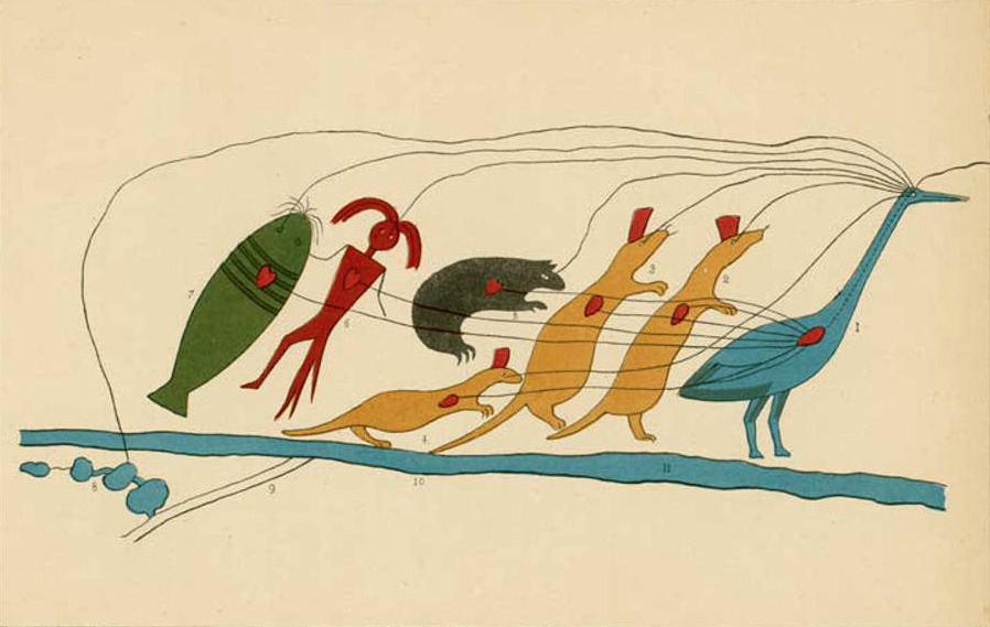
You can follow the link to read more about the interpretation, but the short version is that the map depicts the relationships of various natural features in northern Wisconsin. There is spatial information here, but it’s not presented against the grid to which we are accustomed. The vast expanse of Lake Superior is compressed into the thick horizontal blue line; its true size and shape is not relevant here. Instead, the map depicts understandings of relationships, rather than physical measurements.
While working on my map, I was also reminded of this Slate article on geocentric directional systems (thanks Alasdair Rae for reminding me where to find the story!). On Bali, you might find directions described not in terms of north/south/etc., but instead as to whether one is moving clockwise or counterclockwise around the island, or moving toward or away from the nearest major mountain. It’s orientation with reference to surroundings, rather than a superimposed grid.
I’m not sure if either of these were direct inspirations, but they were certainly in the back of my mind as I got to work, as examples of other uncommon ways of thinking about and depicting space.
Besides an opportunity to play around with a fun perspective, this is also a sentimental and personal project. I’ve lived almost the whole of my life on this map, in one part or another. Lake Michigan has been a dominant feature in my personal geography, and it anchors my understanding of my homeland. If I’d been raised in another context, out in the plains or along the ocean coasts, I don’t think I would ever have thought to do something like this. But, whether or not my upbringing figured in, this map makes perfect sense to me; it feels right. It also emphasizes just how far apart my current home (Madison, WI) seems from my former home (Kalamazoo, MI) when the only path between them involves driving around a vast expanse of water.
I’m certainly not the first to do something like this. Shortly after this post went up, I learned that Nick Martinelli sketched out a hand-drawn example of this linearizing idea earlier this year, in which he straightened out Oregon. I imagine there are other cool examples out there that I don’t know about.
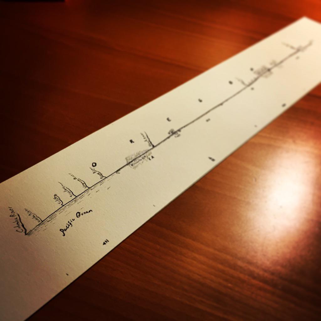
Nick Martinelli’s linear Oregon sketch. Hand-drawn maps are just the best.
There are plenty of other linear maps out there that people have brought to my attention, though the comparison might sometimes be inexact. Works like Ogilby’s maps of British roads start with features that are already linear, rather than straightening out a closed shape.
Design Thoughts
Before I get into how the map was made, I have some random observations/thoughts on the design.
- The whole concept behind the map is weird, and the end product looks odd. Because of that, I wanted to, as far as possible, “naturalize” this distorted perspective — to make it feel like it’s perfectly normal to see the world this way. The warm colors are meant to feel more organic, and also to feel like something you’d see in any run-of-the-mill map. It’s not drawing attention to itself or shouting “hey look I made a weird distorted perspective!” Attractive, but understated.
- The brownish tones are a population density raster. I included it partly as a matter of visual interest, so things wouldn’t be so flat. I considered putting city boundaries instead, but showing the noisy distribution of humans in this way, rather than with hard political boundaries, has a more natural feeling to it. Again, trying to make the map feel more organic.
- I didn’t include a legend for the density. I feel like readers can figure out quickly that “browner = more people,” especially with the city labels being on there. I didn’t like the distraction of adding a legend, especially since the actual density numbers are irrelevant. I have a (possibly annoying) fondness for not really putting much explanation on my maps.
- I decided to go with Gill Sans for the city and highway labels, which I’ve not used much before. It feels a little older (because it is), and it’s a classic. Again, I think it fits the idea of an attractive, understated aesthetic. Using a typeface like this sells the idea that this is a normal and natural way to see the world.
- I used Sorts Mill Goudy for the lakes, because a website told me to. Here’s a real typography geek secret: we often look online to see what other people think, and then if their opinion makes sense we might adopt it. I did a search for “what serif to pair with Gill Sans,” and went with a suggestion that made sense to me.
- The map is formatted to print at the fabulously inconvenient size of 10″ × 60″
- One of the most difficult decisions was how to rotate the map. I actually started with a horizontal orientation, with the land at the bottom and the water at the top. To me, that seemed to embody the feeling of sitting on land and looking out toward the water. However, then Evan Applegate pointed out to me that if I ever put it on a website, people would dislike having to scroll horizontally. So, I rotated it 90° and relabeled it. This is me surrendering to the tyranny of modern digital devices.
- Where to center it was another concern. The map above starts with Chicago at the top, a familiar location. In print, I’d probably put Chicago near the center or just above. If someone’s looking over the whole object at once in person, I don’t think they’ll start at the top the way they’re forced to when they see the digital version in this post. And I want Chicago to be that familiar anchor that people see early on to begin to understand what’s happening.
- All this boils down to: digital displays really limit your ability to appreciate this map, and it would be great if we could all go back to printed maps.
How I Made the Map
So, let’s get into how I made this thing. I began by compiling data in ArcMap, pretty much as though I were making an ordinary map: roads, population density, state boundaries, and hydrography.

Roads
US National Map Small Scale, and the Atlas of Canada 1 million National Frameworks. I selected just the roads that were Interstates, US Routes, or those that were part of the Trans-Canada Highway or Canadian National Highway System.
Rivers
Same sources. There are a lot of rivers in these data sets, and I so I thinned the network heavily. I actually took just the rivers that were in the Natural Earth 10 million scale data. The Natural Earth linework itself was too coarse, but it was a guide as to which of the more detailed 1 million vectors to use from my other sources.
Lakes
As above, plus two more detailed sets — TIGER and Canadian Census Boundary Files. The more detailed sets had three purposes:
- I wanted more detail on the Lake Michigan coastline, since a lot of attention would be drawn there.
- The more generalized Lake Michigan polygon didn’t always line up well with the population data, so using the more detailed coastline helped fix gaps. As I went along, I manually generalized the linework here and there where it was too detailed to look good.
- The coarser, US 1 million scale data were fine for most smaller lakes, but sometimes the lakes were weirdly in the wrong place, so I occasionally had to use the TIGER data to manually correct the position of the more generalized data. I also eliminated all lakes under 0.5 sqmi, just to keep things clean and simple.

States
US National Map Small Scale.
Population Density
For the US, I used Census data. Rather than join the Census data to shapefiles myself, I found some handy ones that already had selected demographics already in the attribute table. For Canada I grabbed some data from Statistics Canada.
As said, I wanted the population density layer to add some visual interest. I wanted it to be fairly finely textured, so I initially used Census blocks, the smallest geographic unit available. But there were way too many of them, and the files made Illustrator unhappy. But if I stepped up to larger units, like block groups or tracts, there was too little detail in rural areas. So, I used a mix: blocks in rural areas, and tracts in urban areas. I used the Census shapefiles for urbanized areas to make the distinction. Doing this drastically reduced my polygon count while keeping all the detail I wanted in rural areas. In urban areas, the downgrade in resolution was unnoticeable at my map scale.

I used my mixed census shapefile to make a sort-of-unclassed choropleth of population density. In reality, it’s got 50 classes, so it’s close enough to unclassed that you can’t tell (since I’m not aware of how to do a properly unclassed one in ArcMap). However, the classing is not linear. Instead, it shows the square root of the population density. I’m a big fan of giving unclassed maps a non-linear treatment (and drafted an unfinished blog post about it years ago). In this case, using the square root reveals small changes in low-density areas, details that would otherwise be washed out. In a linear choropleth, there would be major cities visible and not much else; the density of Chicago or Milwaukee would skew the color scheme so much that small villages and hamlets in the country would be unseen. Taking the square root of the data de-emphasizes the densest areas, helping fix this. Actually, I’ll tell you a secret: I showed the 2.25th root of density, not the square root, because I’m way too detail obsessive. That extra 0.25th of a root made a tiny difference that I liked and which you will never notice.

Notice all the towns that appear once freed from the tyranny of linear color schemes.
Finally, before applying the classing, I clipped the top 1% of the data. So, the very densest places all look the same, and the colors only change when you’re outside of that, in someplace that isn’t in the top 1%. This was, once again, to keep the very densest outliers from skewing everything.
The Distortion
Now comes the fun part: linearizing the map. First, I drew a simple polygon around the lakeshore in Illustrator. Then I bisected each angle in that polygon to create skewed quadrilaterals going both inland and into the lake.

I drew the lines such that each one going inland was the same length. This created a sort of rough buffer around the lake, so that my final map would end up including all places within a certain distance of the lakeshore. For the lines going into the lake, I made them only long enough to cover peninsulae, nearby islands, and any other bits of land that fell on the other side of my original simple polygon.
To actually make the linear map, I needed to take each of these skewed quadrilaterals, un-skew them into rectangles, and then stack them up. But, how does one straighten a quadrilateral in this way?

This is where I drew upon the expertise of Christopher Alfeld, a mathematician/programmer friend, because the answer is: lots of math. I once briefly understood why we were doing what we were doing, but that knowledge has since vanished into the ether. What I am left with are the equations which he determined that I needed to use:
y = y0 t s + y1 (1 − t)s + y2 t(1 − s) + y3 (1 − t)(1 − s)
Here, s and t are the new coordinates of our transformed quadrilateral. After asking Wolfram Alpha to solve for those variables, we get:
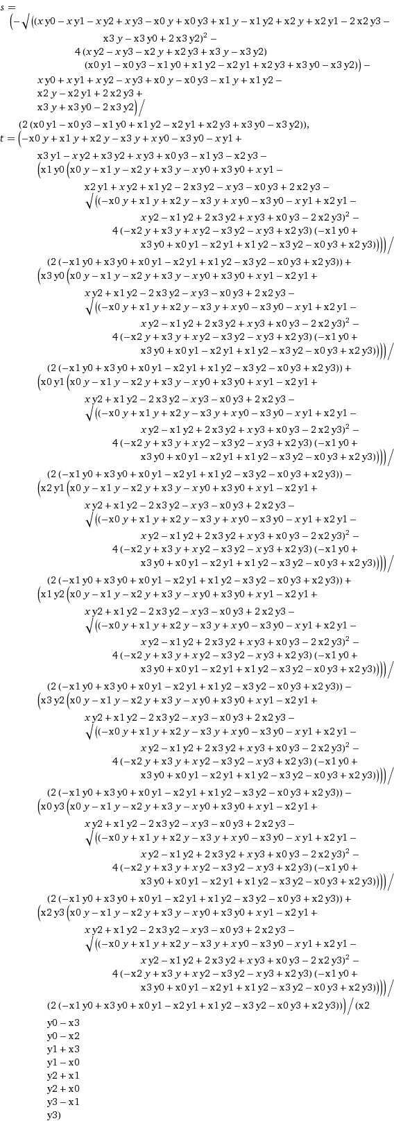
Fortunately, Wolfram Alpha outputs equations as images, so I didn’t have to re-type all this. Unfortunately, Wolfram Alpha outputs equations as images, so I did have to re-type all of this when I actually wrote the code to make the map.
To implement this, I wrote a Python script. It loads in an SVG, applies the transformation, and kicks out a new SVG. I didn’t find an existing Python SVG parser that I could immediately figure out, so the biggest part of my script was writing a simple one.
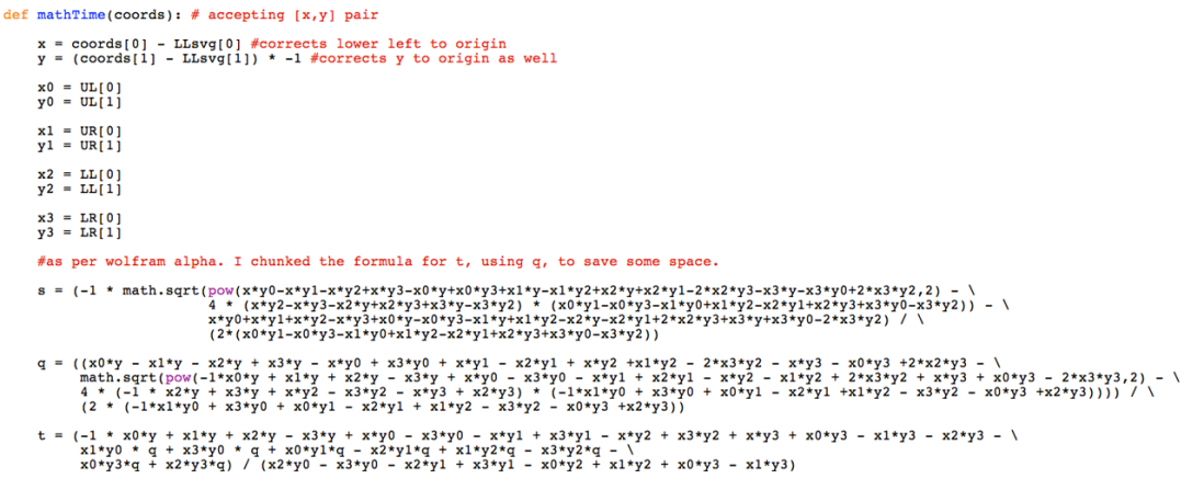
Obligatory code screenshot. I should share the real thing, but I think it needs some tweaks first.
Once all that was settled, I could make the map. All I needed to do was:
- Go to the untransformed map in Illustrator and select one of the skewed quadrilaterals;
- eliminate all the artwork outside the quad;
- save as an SVG;
- run the script;
- load the newly generated SVG into Illustrator;
- stack the unskewed quads together in a new Illustrator document; and
- style everything.
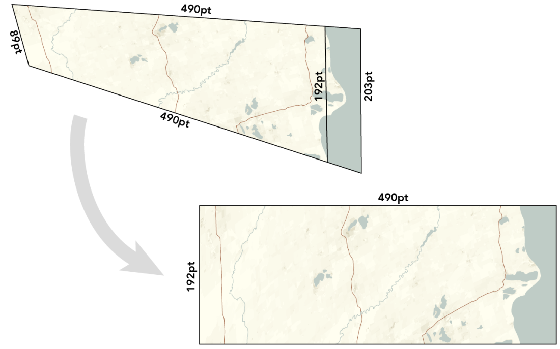
There were a few wrinkles along the way. I had to increase the point density of the linework (e.g., a straight line between two points becomes a straight line between 4 points), so that the shapes could warp a little more smoothly. Also the equation for whatever reason didn’t work right until I first rotated the skewed quad such that one line was horizontal.
What would have been smart is if I’d done this in JavaScript and run it as a script within Illustrator itself, rather than sending it out to an SVG and back. So, that might be the next thing.
City Labels
Finally there was the labeling of cities. I decided not to do every one of them, but only the significant ones. The problem was how to decide what is “significant.”
Labeling every city above a certain population threshold wouldn’t work, as it would miss locally-important small towns while giving attention to every single suburb of Milwaukee or Chicago. Instead, I needed a way to measure regional significance.
I ended up with a process fairly similar to the one I developed for locally-enhanced hypsometric tints. Short version: I used my population density shapefiles to make a raster. For each pixel in the raster, I checked to see how many standard deviations above or below the regional mean its density was (the region being a 25km radius circle). Now I knew whether each pixel’s density was regionally significant, or whether it was merely about as dense as its surroundings. Then, for each city, I summed its pixels to get a score for how regionally relevant it was. Then I labeled the highest-scoring cities.
It worked out pretty nicely. A Chicago suburb of 10,000 people doesn’t make the cut, but a small town of 1,000 in the middle of nowhere gets labeled, as it’s a landmark for the area. It’s very much like the scale ranks that occur in Natural Earth’s populated place shapefile, but I have no idea how they did theirs.
Next Steps
As said, I’m not sure what to do with this right now, other than stick it here. A couple of people have asked about getting prints, and so I’ve also put it up on Zazzle, where you can find a vertical or a horizontal version.
I’ll be presenting on this work, and showing off a print version, at NACIS2015. I’d like to do all the Great Lakes, and put them onto one impractically sized poster that maybe someone would want. Such maps might also make nice wallpaper borders, I suppose, if I went back to a horizontal orientation. Mostly, though, I just want to get them out there and in front of people’s eyes, and provide them with a new perspective on a familiar feature.
If you made all the way to the end of this post, I have a bonus for you: I also did Lake Superior!
Click for an even larger version. Take a while to browse around.
While I offer this project as a free PDF, it does take time and effort; if you derive some value from it, you are welcome to make a donation to support my continued work.


Certainly reminiscent of Discworld, where the cardinal directions are hubward, rimward, turnways, and widdershins.
Now I want a map of Discworld, and a linearized version thereof.
In Hawai’i, maika/makau (not sure about the correct spelling) indicate respectively towards the sea/towards the mountain. Bali islanders have similar ways to indicate directions, according to Wikipedia.
Aside from that, congratulations for. The beautiful maps you made and thanks for sharing the detailed process of making one!
Very cool. One minor mislabeling I noticed: the state border between Indiana and Michigan have the state labels reversed. IND should be on top and MICH below it.
Similarly, if I’m reading it right, the state line just below Chicago has Chicago in “Ind.”, not “Ill.”.
Alas, I seem to have accidentally put up an earlier draft with some errors in it. It’s easy to get confused when working with a map like this! I’ll dig out the fixed version and get that up soon. Thanks for pointing this out!
Having also lived in close proximity to a Great Lake all my life, this projection makes great intuitive sense to me. You’re correct that it should be horizontal, not vertical, though. I always orient myself with respect to the lake, so a directional system consisting of “toward the water”/”away from the water”/”clockwise”/”counterclockwise” makes perfect sense. Very impressive work!
I think the math your friend pointed you to is a 2D homography, which results in 3×3 matrix that will map one space into another given correspondence points.
https://en.wikipedia.org/wiki/Homography
Why are the state names on the wrong sides of the dotted lines?
Fixed now. I had put up an earlier, erroneous draft of the map accidentally. I got unsurprisingly disoriented while labeling originally. Thanks for noticing!
Fantastic Work!
This is really cool. I’ve spent a decent amount of time biking up and down the portion of the coastline around Chicago and this linear view fits nicely with my mental model.
One small correction: Waukegan, not Waukeegan.
Thanks for catching that! I’ve got it fixed. I feel a little more embarrassed than normal because Bradbury is from there and he’s my favorite author.
really interesting and I like how you relate this to First Nations map from 1849. This reminds me of how the Inuit navigate and map their travels in the arctic. When articulating directions to Europeans the Inuit would not provide distances but rather the length of time it would take to get from one location to the next, drawn on a map the distance between locations would be compressed if the land was open and flat but the same distance would be extended if the going was slower. In addition when lost the procedure was to just keep going straight, because at some point you will come across a feature that you recognize (a lake, stream, river, hill) that you would recognize. Perhaps evolution has built in us a need or desire to go straight and the reality of a bent earth revealed to us recently by science is at odds with this evolution?
Posters of individual lakes horizontally centered around different cities would make a nice niche business, especially in the tourist towns along the coast.
Look up Laurence Penney “One Dimensional maps” #geomobldn Oct 2012 London Geomob I think. Also bl.uk Medieval maps exhibit had ancient linear maps following routes (highways n pilgrimages) in pre- cartesian era of mapmakimg. Great aericle, I also spend inordinate amounts of time making maps for fun
Cool result. What could also be interesting is to actually print this map out and join the opposite (short) ends. That way you get the identification of the opposite sides complete and can do a full circle around it.
An even wilder thing would be to print half of this map and then print the other half on the backside (just flipped on the long side). Then, you can give the whole thing a half-twist and join the opposing ends to get yourself a Möbius band of the map which is a continuous single-sided (and single-edged) shape :)
You know, there are interesting things to be learned from this. For example, by just holding my mouse cursor in the same place and scrolling, I learned that my hometown in Wisconsin, despite not really having any cultural connection to the Lake, is roughly the same distance from it as Naperville, Illinois, a city that (in its status as Chicago suburb) definitely notices its proximity. There’s probably something fascinating in that revelation.
Surprisingly (or perhaps not surprisingly), raising linear visual data to the power of 2.2ish is also what basically every consumer-grade computer display does.
I’m absolutely amazed by this. Thank you for posting it and the process behind it.
I’d love to print a Lake Superior one–I think my dad would adore it.
This post isn’t something I come across every day, very much amazed – thank you.
Beautiful map! This is like the opposite of what some Inuit cartographers used to do when they “furled” a longer section of coastline onto a circular piece of wood, to be carried for navigational purposes. I wrote a little blog about this long ago- see here if interested (the latter part of the post: http://nuukmarluk.weebly.com/blog/inuit-cartography
Fantastic! And yes, getting this for all of the Great Lakes would be great.
I also agree with a comment above, horizontal print versions centered on different cities would make for great souvenirs to be sold in those cities.
Nice work!
Why didnt you stretch out peninsulas like Door County, which has the most shoreline of any county in the country?
Good question. Two reasons: 1) It’s a recognizable feature, and I wanted to keep a little bit of familiarity to the coast. 2) The method doesn’t work with sharply-turning, thin features like peninsulae. If you go back and look at the skewed quadrilaterals that I drew, you can imagine that if my coast baseline had followed Door County, the quads would have overlapped over land, which would mean that parts of the land would be duplicated in the final map. In example I showed, there are a couple of places where there’s an overlap on water, but that’s not noticeable on the final map because nothing is there.
On Sat, Oct 3, 2015 at 12:15 PM, somethingaboutmaps wrote:
>
Hi Daniel! Nice work!
We did something very related to this a couple of years ago, we called it Transmogrifiers.
We published a paper at the UIST conference, and released an application that allows you to define similar transformations with quick gestures (sorry, windows only). We motivated it from the point of view of maps, but also visualization in general.
You can see a video here:
If you want to take at the paper or the application, it is all accessible from:
http://transmogrifiers.org
That’s really cool! Thanks for sharing.
On Tue, Oct 6, 2015 at 1:03 PM, somethingaboutmaps wrote:
>
This is very, very nifty, thanks for doing this, and for the detailed discussion of motivation, in particular. I’m familiar with 17th and 18th century representations of geography by means of “sailing directions”, which were textual lists of things to do and geographic features to expect, and I think were a primary tool of much of the age of exploration. Mapping and charts came later. Of course I am quite vague as to specific dates, but your linearized lake shore strikes me as a related form of dimension reduction as an aid to comprehension, and I like it a lot.
One minor technical note, possibly involving twenty-twenty hindsight, back in the day, Mathematica had a way of representing complicated equations as C code. It’s at least possible that the related but more modern Wolfram Alpha product had a way of producing a Python version of a given equation. Then again, that might be absent from the web version, if that’s what you were using.
Very cool. I grew up with an affinity for maps, and drew my own maps because all the available ones weren’t detailed enough or the county maps put my town on the edge (I lived in a very rural area where three counties came together).
Later, going to the University of Minnesota, Duluth I was always frustrated because the streets are parallel/perpendicular to the lake shore, meaning they were 40 degrees off of North, so I approximated and called Lake Superior “east”. However, the locals treated the lake as “south” (go “down” to the lake, I guess), which was off by 50 degrees. So I would get confused when talking to the locals. It would have been better to have terms like “lakeward”, “inward”, and maybe “bayward” and “outward” or something for going left and right along the shore.
I did notice in this map that Lake Huron really drew the short straw :-)
Looking forward to seeing the Lake Huron version on zazzle. If you continue with the vertical format, I hope the lake stays on the right, as my standard orientation is the lake to the east.
Very cool project! Thanks for describing the process in such great detail.
Kind of reminds me of those old car racing video games, where you see the entire track from above (a figure 8, for example), but from the driver’s POV you’re always moving straight ahead, with minor corrections to left or right.
I don’t know what it is, but I wonder if there is a version of this concept that turns rivers into lakes. Not sure what that would mean, or what the point would be.
I was also thinking while I read this that there might be interesting ways to combine this version of geographical space with historical time, creating a spatial timeline, possibly animated. For example, you could show/animate the settlement of the land around Lake Michigan over time and/or the decline of plant or animal species and/or changes in land cover. Doing this on a straightened lake might not show anything that doing it on a lake-shaped lake wouldn’t, but then again…
Finally, I wonder if anything interesting would be shown by applying this to maps of the same body of water (or, I suppose, state/country border) from different times, either about how mapping has changed or about how the actual shape of things has changed.
Nice maps! Regarding the computational problem of warping a quadrilateral into a rectangle. You used a bilinear mapping. You could also try a projective mapping, because the math is simpler in some respects — no square roots. See my 1989 master’s thesis “Fundamentals of Texture Mapping and Image Warping”, https://www.cs.cmu.edu/~ph/texfund/texfund.pdf