“What typeface should I choose for my map?”
It’s a question that cartographers of all skill levels get stuck on, from time to time. Sometimes it’s just a matter of browsing around until you stumble upon the right one, one that looks right to you, in the specific context. And sometimes having a list of inspirations can help. Toward that end, I recently did a survey of some of my fellow cartographers, asking them what typefaces they preferred to use on maps. This list may give you a starting point, or just satisfy your curiosity, as it did mine.
I received 40+ answers, but I’ve simplified things here by only noting the typefaces that were chosen by multiple respondents. I’ve also included some quotes by those who chose to offer them.
(apologies for showing off these typefaces with raster images; I don’t want to pay for the $25/month WordPress.com upgrade that includes SVG support)
Sans Serifs

Avenir is a favorite of mine, and it’s found its way into many of my projects. It’s also the typeface of the Atlas of Design. I think it’s got some character without being too forward. I described it once thusly: “a man in a sharp suit walks up to you and says, ‘let me introduce my friend, the map,’ and then gets out of the way.”
Louis Hill described it as a “very clean, sleek font,” while Joshua Stevens added, “Avenir is legible, crisp, and clean.” All these descriptions are pointing the same way, I think, and perhaps you can get a sense of it.
It’s also versatile. Joshua Stevens pointed out that “it also offers numerous weights for building effective hierarchies overtop a variety of background maps or images.”

Century Gothic is another favorite of mine; I do love a good geometric sans, as do some of my colleagues, it seems. John Nelson’s described it as having “clean mid-century appeal,” and I quite agree. Liam Mason called it “lightweight, modern, and dyslexia-friendly” — I hadn’t heard the latter, but it’s good to know!

Easily the most popular choice on the survey. While some typefaces here received two or three votes, Frutiger got five.
Survey takers commented most on its versatility. Tom Patterson likes its “wide range of weights and styles,” and Dennis McClendon mentioned that “it was designed for readability at very small sizes (on Aéroport Charles DeGaulle signage).” Another respondent added that it has “good contrast on busy background[s].”
Aesthetically, it was described as “clean” (Hans van der Maarel) and “beautifully designed” (Dennis McClendon). Dennis further notes that “it’s not Helvetica, which in the 1980s was sufficient to distinguish a design on its own.” Though I’ll juxtapose that with Tom Patterson’s comment that “Frutiger is the Helvetica of the 21st century.”

Lato is free from Google, unlike some of the proprietary options in this list. One survey taker described it as “bland enough not to call attention to itself, but doesn’t look like a cheap Helvetica (or Arial, for god’s sake).” They “sure do hate the capital W though.”

Another free Google font. Open Sans has, according to Michel Stuyts, “good readability,” and is “good to combine with a contrasting ghosting/halo.” Technically only one person voted for this one, but another one voted for “Open Sand,” and I’m guessing that was a typo.

Adrian Frutiger’s third mention on this list is Univers. I expect he never knew what a world of good he did for cartography.
One respondent wrote that it has “a whole bunch of weights and styles to use,” while another, David, also commented on its “lots of family members.” I’ve likewise appreciated Mr. Frutiger’s various typefaces for this reason — you can create a lot of label distinctions when you have so many options.
David further added that it’s “clean [and] easy to read.” There’s definitely a pattern emerging here with the use of the word “clean” to describe many of these sans serifs.
Serifs
To my surprise, there were only two serif faces that made the list, versus six sans serifs. And one of the serifs is only here because I voted for it, too.

There are actually a lot of versions of Caslon, but this is the one that I use. I’m not picky or deeply aware enough to really make distinctions between them. Technically one survey respondent answered “Caslon,” and then I also voted for it and bumped it to this version.
Kristian Underwood noted that it has a “large famil[y],” and that’s a big reason I like to use it, too. Not only does it have a couple of weights and styles, but it’s also got small caps, and a fairly decent selection of diacritics. I also think it’s classy while also being unobtrusive.
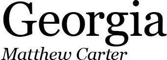
Finally, we end with Georgia. Brian Lewis noted that “it’s serif and not Times,” which I suppose is like the comment above on Frutiger not being Helvetica. He also noted that it has a “strong vertical to horizontal ratio” and good clarity.
The Rest
So there you have it: a few typeface ideas from a highly informal survey of mapmakers. In addition to these, a number of faces were mentioned only once, so I’ll just add them here without further comment.
Serif: Hightower Text, ITC Souvenir, PT Serif, Surveyor Text
Sans-Serif: Adobe Source Sans Pro, Akzidenz Grotesk, Barlow, Calibri, Candara, Corbel, Gill Sans, Grotesque MT, Maven, Myriad Pro, Raleway, Segoe UI, SST, Trade Gothic, Whitney
Both: DejaVu
Probably a Joke: Comic Sans, Papyrus
Once again, respondents demonstrated a very clear preference for sans-serif faces. That really surprised me, I must admit. I suppose I haven’t paid a great deal of attention to the serif/sans ratio on other maps that I’ve seen, but I feel like I make common use of both in my own work, and I just guessed that everyone else did, too. Then again, the survey just asked about preferences, not frequency of use, so maybe it’s unfair to conflate them. It could be that (this small sample of) cartographers use both of them a lot, but just happen to like sans-serifs the most.
Survey
If you’re curious about the survey methodology, I asked
What’s the name of one of your most-preferred typefaces for mapping?
and
Why do you like to use it? What advantages does it offer?
and then allowed people to offer their name for a quote attribution, and/or to offer a link to a map using the typeface in question—ultimately, I didn’t end up using the map examples because they weren’t offered for some typefaces, and I wanted to present each one on equal footing. I had 41 replies, though a few of them mentioned multiple typefaces.
Closing Thoughts
As Ken Field rightly noted, “Keeping an open mind and not defaulting to a favourite helps with being flexible and open to the stylistic demands of the specific map.” However, some maps have clearer demands than others, and the style can sometimes be driven by our personal taste (and, therefore, the typefaces that we find most attractive or interesting).
An anonymous respondent provides a different perspective: “In general though I tend to find a font and stick with it for awhile. Spending an hour each project worrying about typefaces is terribly easy to do, so having a go-to font that I know will at the very least be alright keeps me focused on the other million things to worry about.”

2 thoughts on “Cartographers’ Preferred Typefaces”