Note: In the comments below, it turns out there’s a bit of confusion about what the definition of neatline actually is, and whether or not I’m using it correctly. Like a lot of cartography terms taught in school, practicing mapmakers aren’t always sure what they mean. Feel free to weigh in with your opinion on whether or not I’ve got the right term.
Gentle readers, today I exhort you to beware of the neatline, that quiet little item which encircles our maps and whose most common realization is no more than a simple black rectangle.
The neatline is merely the boundary separating the map from the rest of the page. This innocuous border is known as a “map element,” which is a vague term used in cartography education to mean “all the stuff that needs to go on your map that isn’t your map itself.” Scale bars, legends, neatlines, titles, north arrows — all these are map elements. None of the map elements have much to do with each other, and their grouping under this term is a bit inexplicable, except that it permits academics to make cartography look more complicated than it really is and offers them another vocabulary item to test their students on. I’m not convinced most practicing cartographers use the term or think of legends or scales or the like as belonging to this overarching category of “map elements.”
I’ve probably made my feelings on other map elements like scale bars and north arrows clear. They’re usually unnecessary, even though students are often inexplicably taught that they’re mandatory. The neatline is no different, and it’s high time I took on the pro-neatline lobby.
The first problem I have with neatlines is that they impart an unfortunate sense of finality. Beyond this line, the map ends and the world does not exist, or is at least not thought of. But when we look at maps, we’re often looking at only a section of the world. I want readers to have a feeling that the world continues on beyond the glimpse that the map gives. When possible, I print my maps full bleed, which simply means printing the map from one edge of the page to another, with no margins. It’s a habit I picked up from my time working under Tanya Buckingham, the wizard of the UW Cartography Lab. By running the map over the whole page, I hope to give the reader a sense of continuity; there’s more to the world that you can see here right now, and that the section you are seeing is connected with places that we’re not looking at, and in ways we’re probably not thinking about.
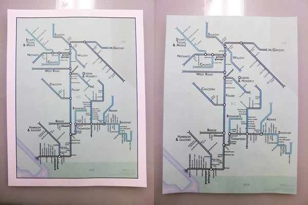
Right: The world continues on, but the lack of paper has stopped me from seeing it.
Of course, a lot of printers won’t let you do full bleed. Instead, I usually feather my map out so that it fades into the page background. Here’s an example from a map I prepared for a wine tasting.
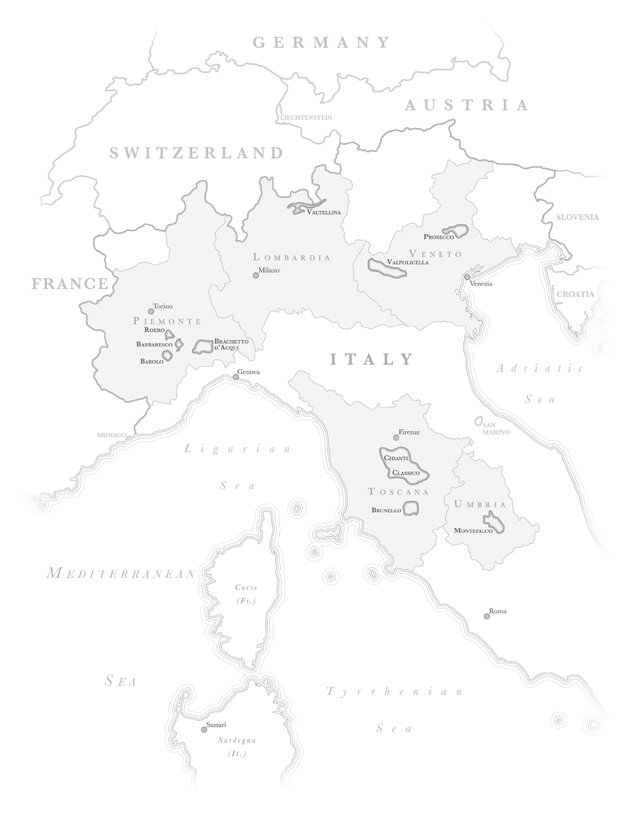
Again, I think this gives the sense that the world has not ended, but that it has simply faded from our sight. It still lurks there under the margins. It puts the area we see in its geographic context.
The other problem I find in neatlines is that they sometimes call too much attention to the separation between the background and the map. It draws attention away from the map itself, and towards the medium. It’s the difference between holding a piece of paper with a map on it and holding just a map (which happens to be printed on paper).
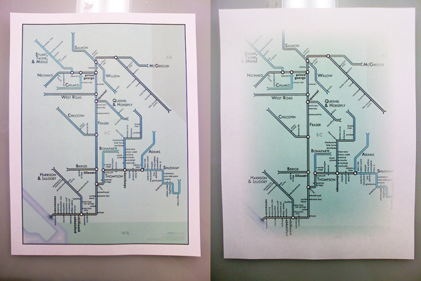
Right: A map, made of paper. One visual object (hastily feathered for this example).
I want to integrate the map into the medium in which it’s being presented, so that readers don’t focus on how it’s framed, how it’s placed on the page, etc. Those are extra steps which get in the way of their engaging with the map. Part of this integration comes from how large the map is relative to its page, but a lot of it is in how noticeable that boundary is between them. Many map layouts have a problem I have (just now) starting calling boxing. Everything gets its own little frame, and so the whole page looks like it’s build of separable puzzle pieces, rather than being an engaging and integrated whole.
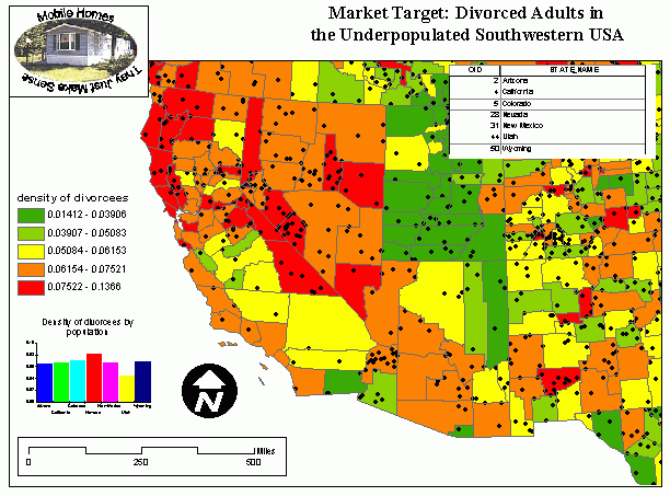
Source: http://courses.washington.edu/gis250/lessons/map_layouts/
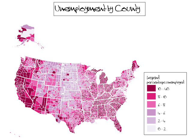
Source: http://geospaced.blogspot.com/2009/11/choropleth-mapping-challenge-in-qgis.html
Both of these examples above would be better served by removing all those little borders and frames (and a bit of rearranging). Don’t put boundaries between the map and its legend or title. Don’t separate it from the medium it sits in — let people hold the map in their hands, rather than holding a paper with a map printed on top of it.
All of the above criticisms have a print destination in mind, because I’m an anachronism — a thirty year old cartographer primarily interested in static print work. But, I think the concept can be applied just as well to the web. Maps can fill the width of the browser window, or they can be given feathered edges. The idea here is portable, certainly, though the particulars of how it is achieved may vary.
Though I’m all for dropping neatlines and integrating the map into its page, it can be taken too far. On Cartastrophe today, I explored the unfortunate consequences when someone fails to distinguish at all between the two.

Certainly, it needs to be clear to readers where the map ends and the rest of the page begins. Neatlines are one way of doing this, but I think there are better alternatives. To be sure, sometimes these alternatives are not always practical. Full bleed or feathering won’t work for every situation. Even so, neatlines are usually not necessary, if colors are chosen well. The map below has no neatline, but I don’t think anyone will be confused as to what’s the map and what’s not. Throwing a black line around this thing won’t do anything more.
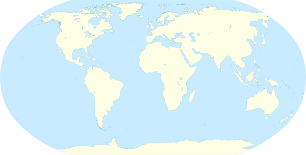
I don’t mean to suggest that neatlines should never, ever be used. I’m taking somewhat of an extreme position here because I like arguing about cartography. But I really do try to avoid them whenever I can, and I really do believe that, at least sometimes, a neatline turns a map into a map-on-a-piece-of-paper and breaks the reader’s sense of geographic continuity (even if other people think I’m crazy and making all of this up). All that said, there are certainly situations where neatlines are useful. Insets come to mind — putting one map next to another usually requires a clear distinction to be made between them. Admittedly, I’ve tried (with mixed success) to do away with neatlines even here, putting two feathered maps near each other and hoping that my readers’ knowledge of geography will prevent confusion. But that may be taking things farther than is reasonable.
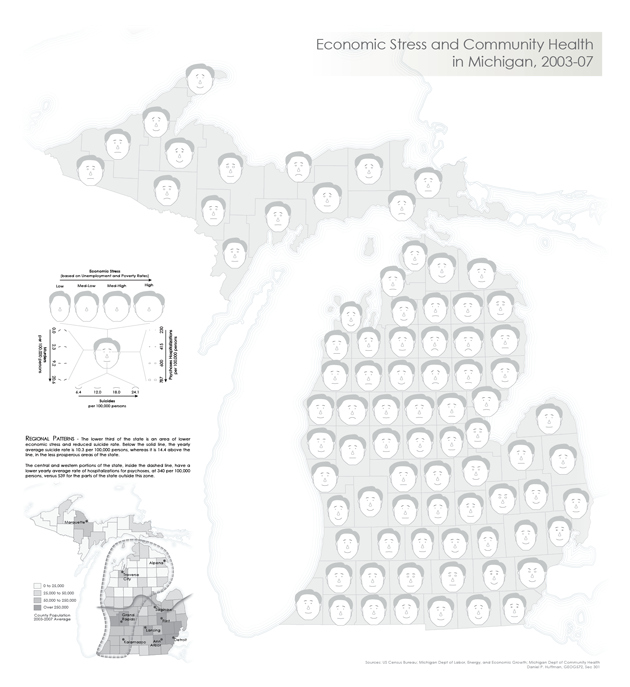
In the end, all I ask is that you please think carefully the next time you intend to apply a neatline. It’s easy to use, but generally unnecessary and possibly harmful. Let your maps integrate into their environment without boundaries.
Amen. I was the UX and map designer for the first release of Microsoft’s Virtual Earth (now Bing Maps) and one of our main tenets was the full screen map, with all UI floating above it. As you suggest, full screen map = the world is very big; map in a box = UI is more important.
I was going to ask about insets, but you addressed that question. I have a couple other thoughts, though.
1. A lot of what you’re saying about maps is relevant to (data) charts, as well. I’ve been preparing a lot of data recently, and put a lot of thought into their design. Clarity… Aesthetics… Plus, like you, I think a lot of the “mandatory” elements just waste space, which is really at a premium, just for the purpose of explaining something that is self evident from the layout of the chart itself.
2. What is up with that divorce map? To me, it doesn’t really serve any purpose except to bolster some ridiculous claim from some holier-than-thou… Or maybe to throw statistics back in the face of same… But the big boggler there is the “mobile homes” box. Huh?
A very good point, that these things apply to other data visualizations as well. People seem to be fond of telling you what the graphic is, even though it’s obvious. A lot of map titles say things like, “A Map of X,” when that’s plainly evident.
The divorce map is entertaining. It’s from a course website, so it was probably thrown together for example purposes only. The choice of data and logo and the like may even have been tongue in cheek.
I don’t know, I still like neatlines for printed maps, just looks better. I think most people understand that there’s more to the world than just what’s shown. For web maps, though, absolutely.
Thanks for this post. I still remember the painful job interview where they were fixated on my forgetting “neatline” among the “essential” elements of a map (along with those old standbys north arrow, scale bar etc). I’m not sure why but some people just cling to rules such as these in the absence of putting thought and effort into design.
Perhaps I’m mistaken (or just unique in this), but I have never actually thought of the black line itself as the neat-line, rather the boundary between that line and the map itself. The line itself is the frame (or maybe an inner frame if there is a more elaborate outer frame with grids etc.). The point is that to me a neat-line is where the map features are uniformly cut off from the rest of the page and in that sense an ocean that stops at the page margin is hitting its neat line (same for your representation of the modified globe above, the ocean describes its own neat-line without the need for an actual black line).
Would be curious to hear back from other cartographers if this at all fits their view of the neat-line and frame arrangement?
It’s entirely possible I could be using the term wrong. I remember being taught that there were neatlines, borders, and frames, and that these terms could all mean different things. But they were also inconsistently applied. This probably just goes to emphasize my point of how what textbooks say is not what cartographers say when they’re actually making things.
But I’m against whatever those framing lines are, regardless of their proper name =).
Very true, there seems to be academic cartography and practical cartography (or maybe cartographic practice) and they don’t necessarily share he same conventions or vocabulary. I seem to recall being confused by the distinction between a frame and a neat-line in undergrad and I think that was because the instructors was confused himself. I basically decided that it made more sense to think of the neat-line as the boundary between the frame or border and the map, rather than the actual boarder itself. I suspect a lot of other cartographers do the same but not sure, that’s what I’d like to see some replies about, how current map makers define the neat-line?
When first reading the article, I thought I had remembered being taught that the neatline was some kind of casing that went around the whole map and all its elements (not just the geographic part). But then I thought I must have been remembering wrong. In any case, I make maps every day and a neatline (by either definition) is not something I really think about. I certainly never use one by the definition I remember being taught, but I usually use one by the definition in the article – probably because ArcMap puts it there automatically!
I always think of the neat line as marking the margin of the printable area, so its more of a guide for printing. dont want anything outside that if its going to be cut off in the printed version. The borders around legend, title block, inset maps, main map, etc i think of as frames.
You know, I always thought of that as the trim line, and the bleed being anything that goes outside of it.
I really should do a survey at the next NACIS conference to figure out what all these words mean to people.
I’ll second that regarding the trim line. I worked in print cartography for 10 years and that’s what we called it. The neatline, as un-defined as it may seem from all these questions, is definitely the line that contains the map image itself and is not necessarily the same as the trim line or even the frame (although it can be). In fact I think the fact that the neat line can and often does appear as part of a frame or trim line is why there is often so much confusion about what exactly it is.
Clearly, we need more neatlines in all forms of media printed on paper. http://imgur.com/a/wBg1I
Nice! Definitely improved my understanding of that paragraph, to know where the text was done.
>________________________________