Update: I’ve started selling these maps now. For more information (and images), click here.
Lately I’ve been working on a series of river maps, done in the style of Harry Beck‘s famous London Underground design. Not sure why, but it seems like this style of cartogram has become trendy lately. Many people, for example, have tried to apply the technique to the US Interstate system (here, here, here, and here). I thought I would try my hand at it with a different subject.


I don’t think people are used to seeing and thinking about rivers this way — realizing their interconnectedness, their importance in the establishment of settlements, or the fact that they were humanity’s original transit networks. It’s not something I’m ignorant of, but I don’t think about rivers like this regularly. I’ve lived in cities that are on rivers without ever noticing. Rivers are to me are often just those thin blue lines lost in the background of a lot of reference maps.
Putting a map like this together is one long string of semi-arbitrary judgment calls, it turns out, and it’s probably a good experience for any cartographer who is not yet fully comfortable with the whole “generalization and abstraction” thing that is the basis of our art. We have to simplify the world down all the time, and that sort of necessary elimination of detail has always been a bit of a challenge for me.
I’ve made four of these maps so far, and I thought people might be interested in hearing about my process and the decisions I had to make:
Tracing Rivers
I set up a quick base map in ArcMap with rivers, state boundaries, and settlements. I use this as a reference point for my drawing/tracing. Rivers I usually grabbed from either Natural Earth or the National Atlas, depending on the scale I was working at. From there, I usually had to thin the rivers out to something manageable, and my choices there depended on how big an area I was covering and how many I could fit in before things got too busy. This leads to a question, though, of what to call things and how to choose which rivers to include. The longest river in the US is not the Mississippi, but the Lower Mississippi/Missouri/Jefferson/Red Rock, as explained here. The same name doesn’t always get applied to the main branch of a river. I usually looked for the longest stretch of river I could piece together, regardless of how many times it changed names, and went with that (though not always) for my map. If I were making a map of the US with one river, I would have shown the combined longest chain of Mississippi/Missouri/Jefferson/Red Rock, eliminating the part of the Mississippi that goes up into the Midwest, since it’s shorter.
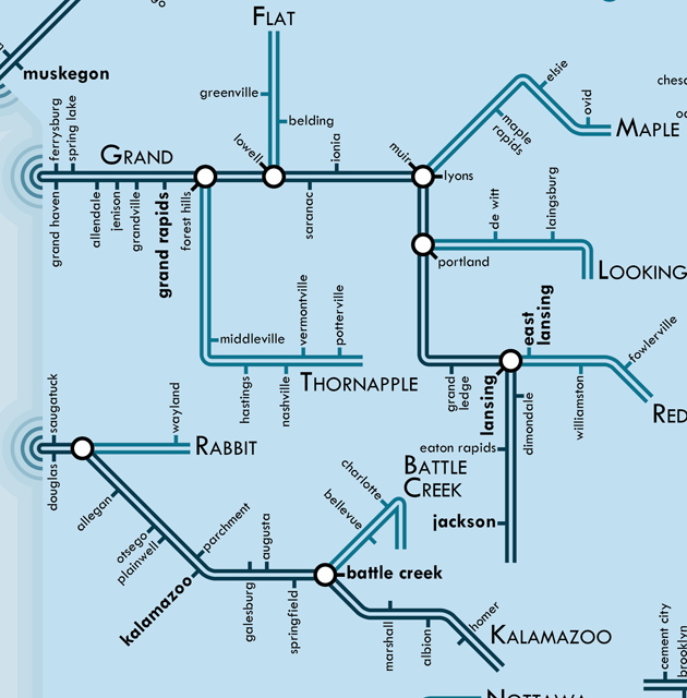
I (usually) called my rivers by all the names they are given along the course. This is why you see ampersands in the example above for river names. Sometimes if a river changes name for just a short stretch (as in the Missouri-Jefferson-Red Rock), I cut off those short stretches to keep things simple (keeping things as just Missouri). I also left of the “river” part of the names, partially because not everything is called a river. Sometimes they’re called creeks, streams, licks, kills, etc. In trying to keep it simply, I just went with the main name of the flowing water feature, not its “type,” which is usually pretty arbitrarily. I also kind of like the way the names come out — “Kanawha & New” sounds like the name of a transit line.
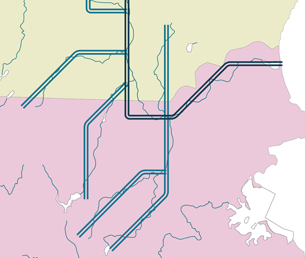
Once I had my rivers picked out, I started by creating the river lines. The hard part here is that I’m constrained to 45 degree angles if I want to keep Beck’s original style — and I do. I like the schematic appearance it has, the conscious geometric relationships established. I have to approximate the river courses as best I can.

If I tried to draw those over again on a different day, I’d probably do them differently. It’s a pretty approximate process, but it’s also rather fun.
Places
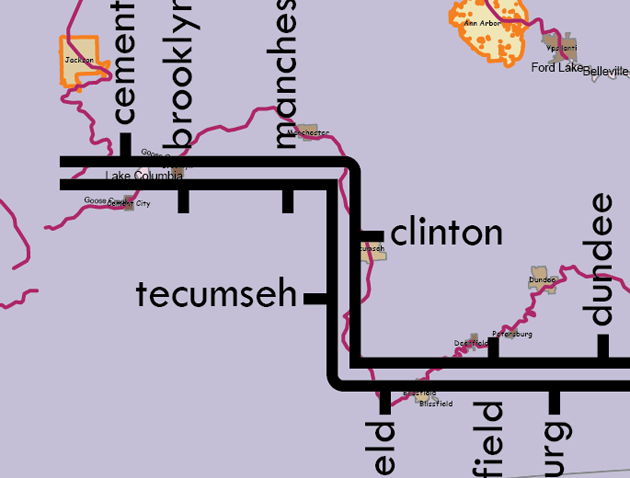
Next I put populated places as stops on the river lines. This is probably the hardest part, as far as making judgments goes. What is a populated place? There are cities along rivers, to be sure, and I use a data set of cities and other incorporated places to help me. But there are also a lot of places people live that are less well-defined, places that don’t have a legal name and legal boundary. Places like Republic, Michigan. Those are a lot harder to judge. The Census Bureau helps by defining limits to some unincorporated communities, but that doesn’t cover everywhere.
If I see a settlement along a river, I look at two things: business names and post offices. Does the settlement have a postmark that gives it a name people are used to writing on their mail? Do people name their businesses after what people think the settlement is called? Both of these help me get at the reality on the ground — no matter the legal status of a place, I want to show what people who live there call it, what they think of it as being. I also cross-reference my name choices with Google/Bing Maps, Wikipedia, and the BGN. Sometimes I run in to a settlement where all the businesses, and the post office, name themselves after a larger, nearby town. The people there appear to have less of a separate place identity, so I don’t include them for lack of a name.

I don’t live in all of these places, so it’s a challenge to try and understand how people who live there think about these hundreds of settlements. I may have gotten some wrong, though, if I did, a lot of other cartographers likely did, too, and the people who live there are probably used to it. New England was particularly tricky because most everyone lives in the boundaries of a named, incorporated town, but they also usually live in an unofficially named village within that town.
If you notice in the image above, the tick marks switch which side of the river they’re on. That’s to indicate which side of the river the settlement is on, primarily. Sometimes that’s really clear, but sometimes settlements span both sides of the river. Here again I used Google Maps, to look at satellite photos and street densities and to try and determine where downtown is. Usually the commercial center and civic is clearly on one side of the river or another. If I’m in doubt, I go with the location of the city hall or public library or some other major service building.
The last big choice is: when is a place on a river? Sometimes it’s not clear. Sometimes formal city limits extend to the river banks, but those limits encompass empty land — the actual population center isn’t on the river. Other times cities are separated from the river by their dependent farmlands. I generally included places within a mile or so of the river, counting the population center only, ignoring where the city limits technically went. I tried to imagine what would happen if you stopped your boat along the river’s edge and asked someone where you were. Even if you’re not technically in Greenfield, California, you’re probably close enough that it’s what people will say.

I was more forgiving of settlements being not exactly on the river when there were fewer people around. This is partially because I wanted the put something on empty stretches of river lines, but also because there are fewer answers to “where am I?” when the nearest settlement, three miles away from the river, is the only humanity for twenty miles around. So, sometimes I went out a little farther, up to five miles on rare occasions (Simmesport, LA is not at the confluence of the Red River & the Mississippi exactly, but it’s about the only thing for miles around). But in more densely settled areas, you had to be closer the river to merit inclusion.
Distort the Rivers
Even though the rivers are already a gross oversimplification of the real stream network, more distortions are needed. It’s not possible, usually, to label everything clearly and have all the network connections be unambiguous while keeping the river lines and settlement locations in approximately the right place.

So, I stretch out or shrink certain parts of the river, and move settlements around, to keep everything clear and easy to read. I also move whole river systems around to space them out more clearly. Understanding the connections and relationships is the goal in this design. Spatial accuracy is great, and I try to keep it where I can, but it’s secondary. Also, this part is, again, fun to do.

Draw Areas
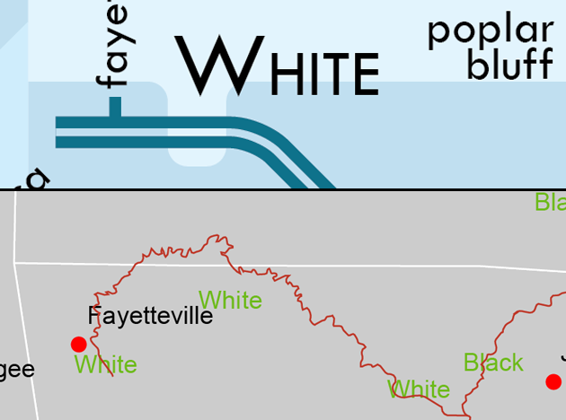
Lastly, I draw in the boundaries of states and lakes and other area features. I draw them according to where the rivers are, which means that sometimes they get pretty distorted on account of how I had to adjust the rivers (see states in the Mississippi River map above). I also run into interesting situations like this:

The White River weaves across the Missouri-Arkansas border, but when simplifying the rivers down, I kept it straight in that area. In order to make sure that the river and the state borders show the correct relationship, I had to add that little notch to the state border, so that the White travels out of Arkansas, into Missouri, and back into Arkansas again.
Misc. Issues
I didn’t deal with navigability of the rivers — you can’t actually sail from the source of a river to the mouth, it’s just too shallow in some areas. That would have taken probably way too much research, and I don’t know as it’s the best criterion, anyway. There are plenty of cities on rivers that draw drinking and irrigation water, even if they can’t ship goods down the river, and I think those are important relationships to show.
I went with a blue color scheme, to emphasize water. But then everyone said I should not use so much blue, so I switched the background to more of a blue-green, which you can see in the detail images of the final product linked here. Most everyone seems to agree this is an improvement (though I am still fond of the blue scheme seen in the examples on this page). Several people have also told me they’d prefer that I do these with a wider color range of bright reds and greens and such, like a traditional metro map. I may consider making a variant in the future, but for now I prefer the subtlety.
The type is set in Twentieth Century, a geometric sans designed in the 1930s by Sol Hess. This is a bit of a departure for me. I set most of my work in Century Gothic, which is a 1990s face that draws inspiration from Twentieth Century. This time I decided to try out the source. I think it helps contribute to the feeling of the design being out of the interwar/WWII period. The typeface is of the same era as the original style I’m making an homage to, and they feel like they belong together. Twentieth Century’s design emphasizes geometry — straight lines and simple curved shapes, just like the river lines. I am also overly enamored of the lowercase j and the capital M.
That’s the basics of what I did, and now you know how the sausage is made. It’s been a fun challenge, and I’ve become more comfortable with changing the course of rivers, or eliminating someone’s hometown, with the sweep of a mouse. Getting rid of most of the world’s detail is a necessary part of cartography, but it’s never been one I’m comfortable with. This has helped quite a bit, though.
Any good map is a collaborative effort. My colleagues in the UW Cartography Lab have been most kind in giving me lots and lots of feedback to help me move from one draft to the next. Special thanks go to Isaac Dorsch, who suggested the concentric circles which you can see used above where the river meets the sea (or, in the case of the above, Lake Michigan).
Wonderful work indeed. Kudos.
Beautiful job on the map and thanks for providing so much detail into the process.
That’s a great typeface – which is it? I like the all caps/all lowercase/bold system you use; the heirarchy is automatically clear .
Hi Andrew,
The typeface is Twentieth Century, by Sol Hess. It’s a really great one, and I’m also fond of Century Gothic, which is somewhat derived from it. It’s funny you should ask — I had a section one the other river maps page describing the typeface, but I recently removed it in order to be a bit briefer in my text. Maybe I’ll put that back.
I’m most fond of the capital M and the lower case j.
I look forward to the day when all maps have political lines far in the background vs a prominent feature.
It wasn’t described but seems obvious…the darkest lines are the main river, the lighter the line gets, the “thinner” the river?? and the dashed lines indicate dry river beds? (i’m looking specifically at the colorado river system). How “big” or “wide” does a dry river have to be to merit inclusion?
also i noticed you included the Parker Dam, but not Hoover Dam…odd choice that.
Hi Michael,
It’s not necessarily the width of the river so much as just the order of connection — the darkest one drains into the ocean/lake, and they get lighter as you have lines that are at a more distant level of connection. It’s really just for a little visual contrast rather than meant to convey significant information. The dashed lines are intermittent rivers, shown as sort of “express or limited service” routes. I’ve been keeping the explanation on the map minimal on purpose, to keep things clean and simple and to let people have fun figuring out what’s going on.
You are not the first person to ask about Parker Dam (see other comments above). I’m not indicating the dam itself, but the name of the community next to it.
As to the choice of rivers, I used the Natural Earth data set (naturalearthdata.com), which has thinned out the many many streams into the most hydrologically important and major ones. I am not sure as to all the details of how they choose (though I have made an inquiry for just this reason), but I imagine that most of those intermittent streams carry a fair amount of water when they’re running.
Thanks Daniel!
It might be a worthwhile addition to include major dams and/or lakes in future versions (analogous to stations?). Again, being partial to the Colorado (i live in Flagstaff AZ), seeing the Hoover Dam, Lake Mead and Lake Powell would be great.
My suggestion for the next river map would be the Rio Grande (which forms the entire Texas/Mexico border).
I want to get a custom one … of a creek in PA that I flyfish … with labels as we have named the spots.
Would you be willing to do for a fee?