Let me tell you about one of my favorite maps.

I’ve seen it on various t-shirts around Madison, Wisconsin, the city in which I have lived for the past four years or so. It’s an emblem of sorts for we who are proud of living on an isthmus.
I love this map because of its simplicity, and how that simplicity exemplifies good and clever cartographic design.
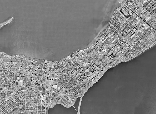
I like to bring this map up as an example to people because it helps explore the edge of the term “map.” It certainly doesn’t look like most maps (except, of course, the increasingly-poplar typographic maps). But to me, its unusual appearance simply brings into focus what a map is and is not. This is a representation of space, and one in which there is a correspondence between space on the page and space on the Earth. The isthmus of Madison runs roughly southwest-northeast, and to either side there are lakes. This relationship is preserved in the representation above. It’s authored, like any map, and it is graphical (it functions through its appearance). Those are the four components of map-ness, to me: authored, graphic, representation, spatial.
So, first off, I appreciate it because it permits me to be needlessly pedantic about what makes something a map. Beyond letting me show off in front of others, though, I appreciate it even when no one else is around. I enjoy its simplicity and its economy. It’s a very highly generalized map, breaking down the area into but two categories: lake and city. It’s a reminder to me that you can still convey a message with a map that is ridiculously simplified. Adding any more detail here would get in the way. All maps tell stories. Some are short, some are long. This map is a slogan. Unfortunately, there are a lot of maps out there that don’t say much, but take a lot of space to say it, and they could learn a thing or two from this one. Here, the message is paired perfectly with the level of visual complexity used to express it. I imagine there are a lot of more detailed maps out there that could stand to be distilled down into three words. I have some problems with those who worship Tufte’s doctrine of minimalistic, ink-efficient design, but those ideas can certainly be instructive.
Finally, I appreciate the fact that, like typographic maps generally, it needs no legend. When you look at this map, you see what it is. The interpretation of map symbols should ideally be seamless. As mapmakers, we work in the zone of representations. People see through maps — they don’t look at Google Maps and see yellow lines and blue polygons. They see roads and water. It is our job to make that representational layer transparent, so that people see what our symbols mean, not how they were constructed. A legend absolutely destroys that transparency, because it makes someone aware of the symbol’s mediation, and forces them to scramble for its meaning.
I’m not a big fan of legends. While they are certainly necessary and useful at times, I’d rather mark things directly on the page if I can. Too often, you find maps like this one, in which the legend serves only to waste everyone’s time. A lot of people have been unfortunately indoctrinated with the notion that a map must have a legend, when they should be used sparingly.
What I would be keen to see is something which expresses this economy of design, and this easy legibility, but does not use type. I’m sure there are examples out there, and it’s something I will have to ponder in my own future work.

So what do you think of the Madison flag? http://en.wikipedia.org/wiki/Flag_of_Madison,_Wisconsin
I love the city flag — there was someone who lived a few doors down from me who used to fly it, and I was impressed by its simplicity and unforced symbolism (for forced symbolism, see Chicago’s flag, where the point of each star is made to stand for something). I think it was ranked among the top flags in the country by some vexillologists, for what it’s worth.
I agree – I love the simplicity of this map (and, like you, would love to see a map like this without text, but not sure how you would do it). However, the problem I see with this map is that if you aren’t from Madison or aren’t familiar with its geography, you probably wouldn’t know what it was referring to or that it was a map at all.
Nicely put on why this map/slogan is so great, and “seamless” map interpretations. I’m with you on legends, and similarly in the interactive realm I’m opposed to those initial “how to use this map” screens that it seemed we were encouraged to include a few years ago.
What do you imagine could be as economical and legible as this typographic map? Something pictorial, perhaps?
The city flag is nice, but it’s not obvious what the stripes stand for, so it’s not quite as good as the text. I think something pictorial could work nicely, but this morning I’m having trouble putting a concept together mentally.
The “how to use the map” screens do have the advantage of occupying the user while the map loads. My favorite example of “something to do while you wait” was in a soccer game (I think it was EA FIFA 2011). While it’s loading the players and setting up the match in the background, they give you a single player on an empty field to practice shooting and movement. Would be interesting to see the concept applied cartographically — give you a quick pre-map to read or interact with while the real thing is getting up to speed.
I dig this. Anybody know where I can find it for sale on a t-shirt? I checked CafePress and Zazzle.
I’ve seen them around State Street in Madison. But I wasn’t paying a lot of attention, so I can’t say as I remember where, and/or if they were only a temporary item, so I’m afraid I can’t be of much help to you.
>________________________________